Parallel Dating Logo

Parallel

Blockchain Based Dating App

Helping a small team of developers and visionaries build a new blockchain based social network.

What's different about Parallel?

The cornerstone of Parallel is two things; being upfront with your intentions and revealing information about yourself only when necessary. The founders of Parallel believe current dating apps aren't clear in what someones expectation or intentions are in a relationship: is this person looking for a one night stand or something serious? Parallel starts by asking users to clarify what they want before talking about the details of it. Parallel is a dating app to use while you're on a date, not to find people to date.

Parallel Dating app Concept

Problem #1: Exposed Identity

A problem with being on any popular dating app is having your information on display for everyone, that includes everyone you know. The founders spoke of how embarrassing their experiences have been with finding coworkers, siblings, and even parents on dating apps. Compound this with having all of your preferences exposed and sexuality on display. How honest can the average person be if all of this is exposed? Can you really share your intimate desires? The answer is many is: no, hence the need for other apps.

Identity Issues on Tinder

Problem #2: Relevancy

When you connect with someone on a traditional app you need to do all the work making a judgement on whether that person is a good fit or not. You're usually looking at very static information through one lens and having to go off of surface level interests to spark a conversation. A few apps do this well in matching you with other people but it ends up being the same type of exchange of information. The founders wanted to give a middle ground and mentor people on what to connect based on what they think actually matters in a successful relationship.

comparing answers

Problem #3: Scammers

Cat-fishing is surprisingly common on the dating scene and many have been burned by other types of scams. We've heard stories from users about giving money away, other people showing up to the date instead, people using old photos, and so on. The founders wanted this to be secure for people using it in ways that would prevent people from hacking their profiles but also using this app maliciously.

Dating App Scammers

Where to Start

When I joined the team was heavy on developers who were all building different architecture for potential features around loose ideas from the founders. Sometimes developers can get more excited about using their tools than stepping back and understanding what it is they’re building.

My role on this team wasn’t just to make pretty interfaces for an already baked idea from a dev team. It was to take these rough ideas, digest them, and produce something that the developers could work on. In order to do that I had to spend a lot of time understanding what the goals were, where we wanted to be at what time, and fleshing out how all those features worked.

Describing an elephant
UX design role

My Role

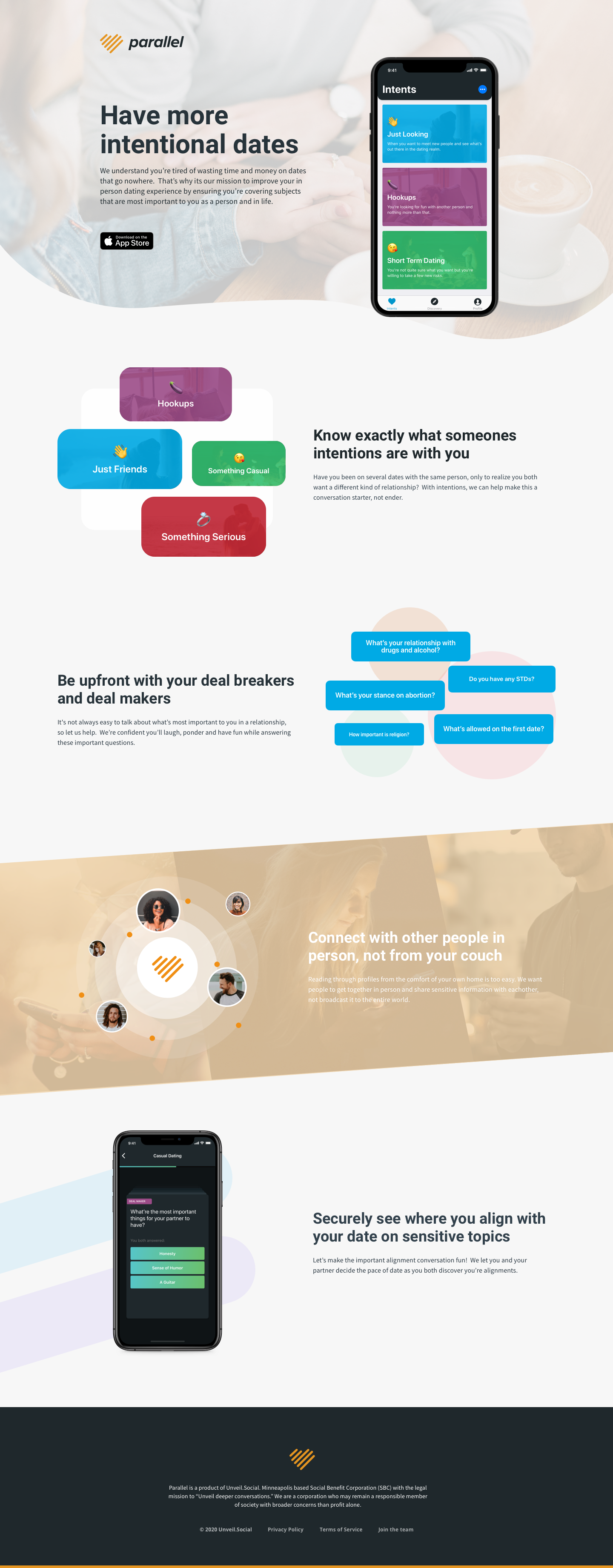
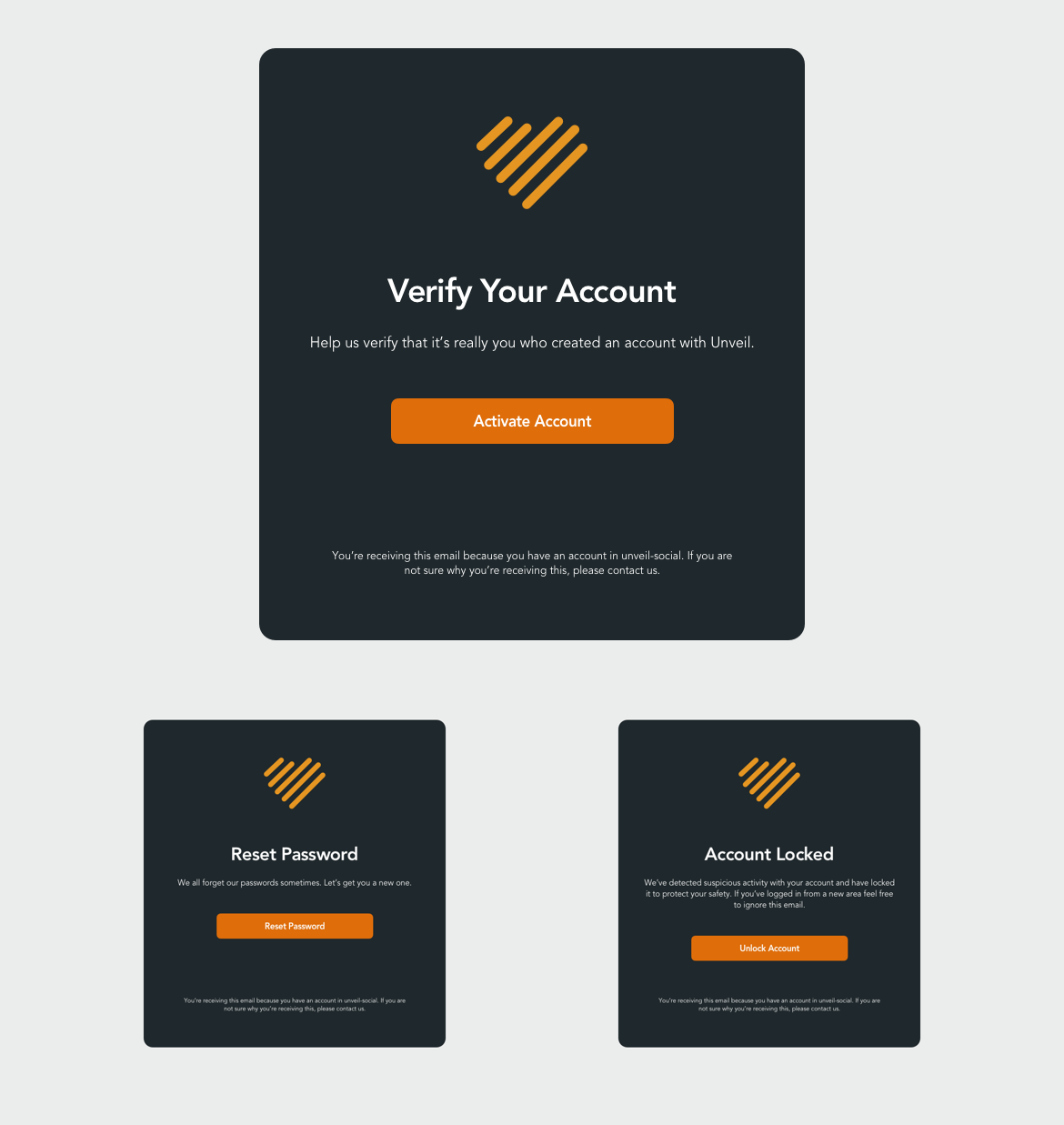
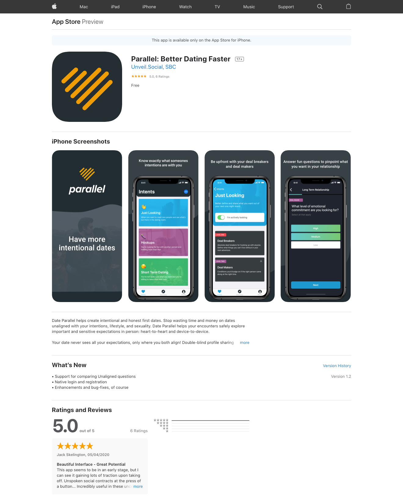
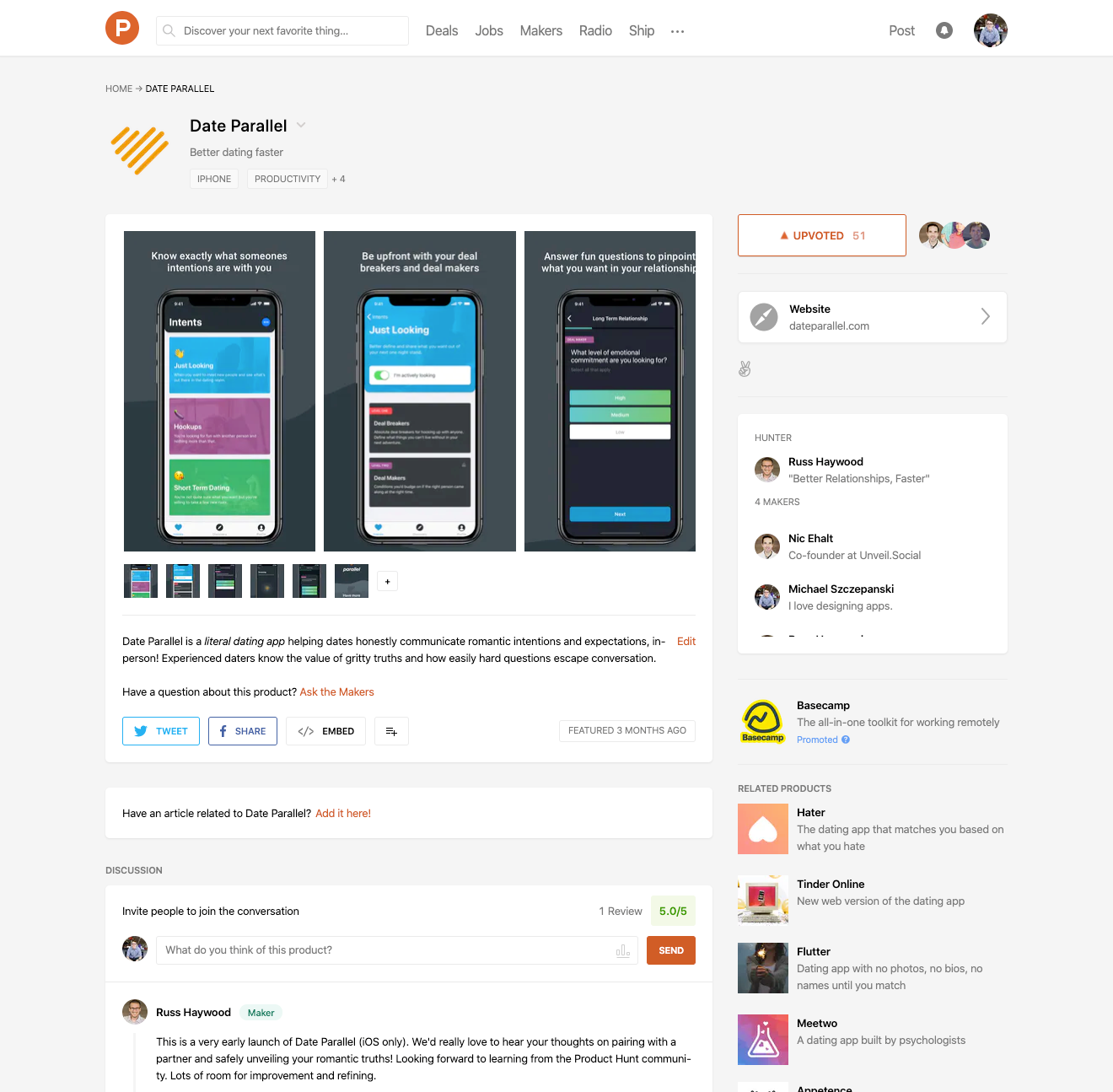
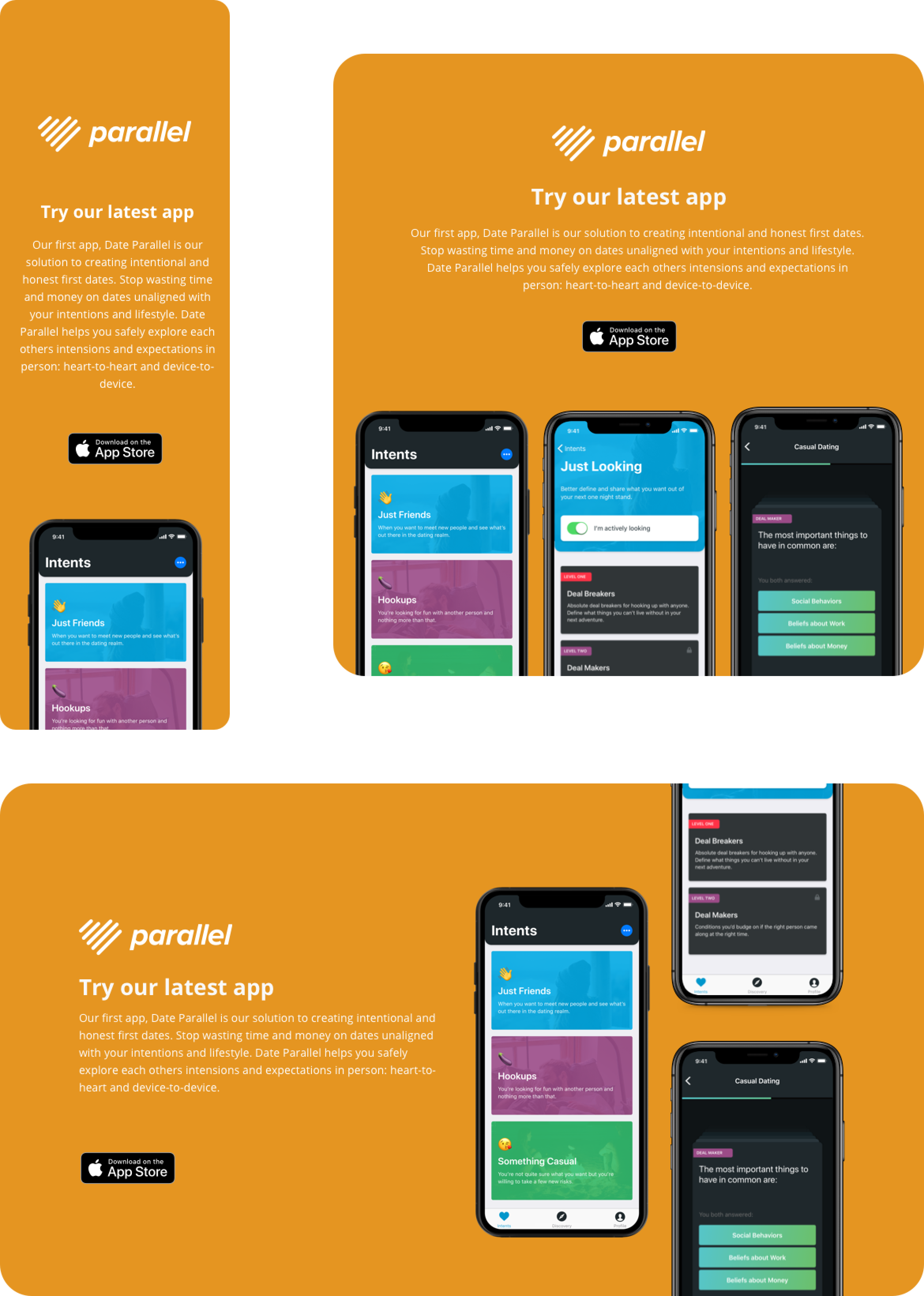
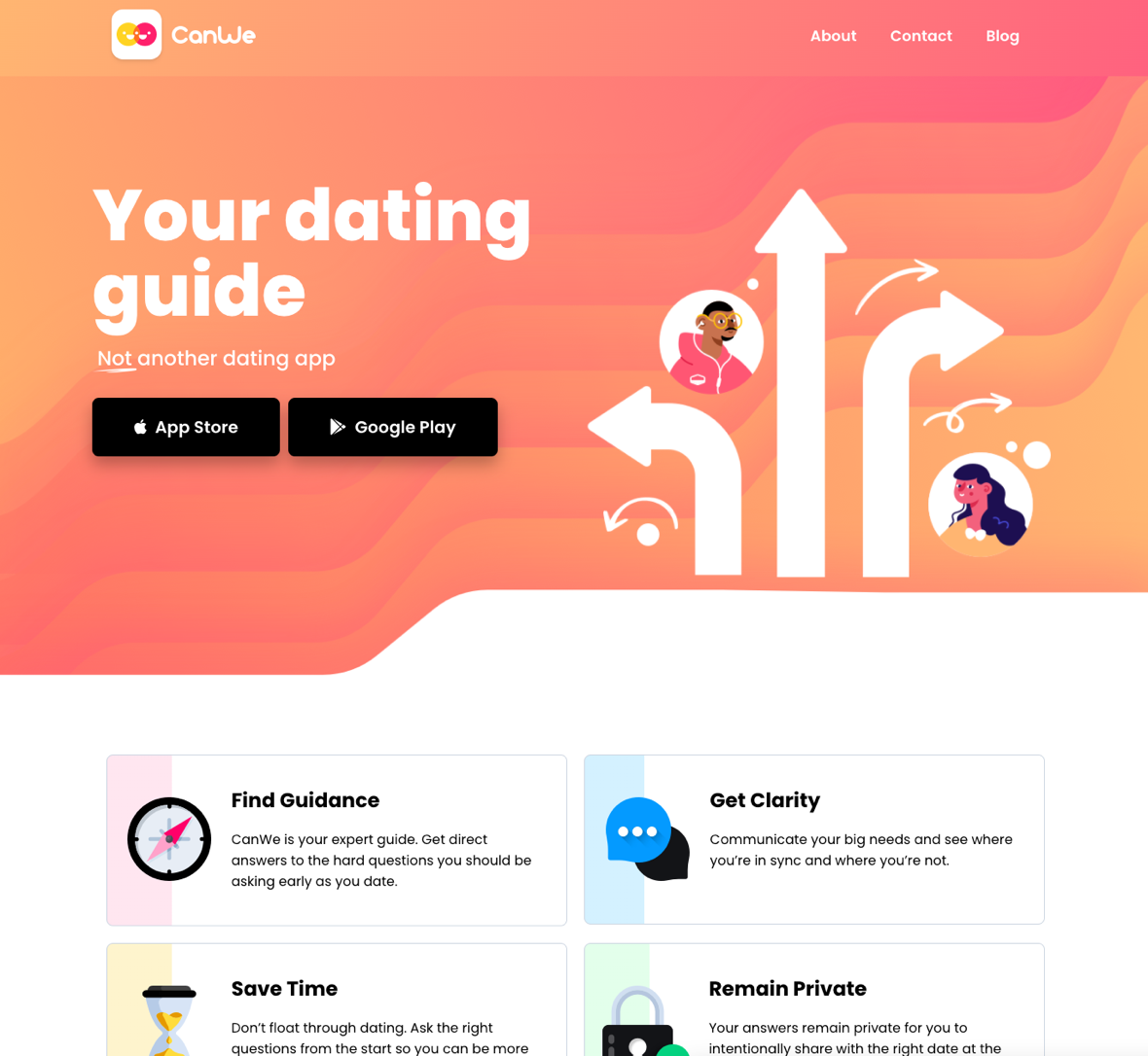
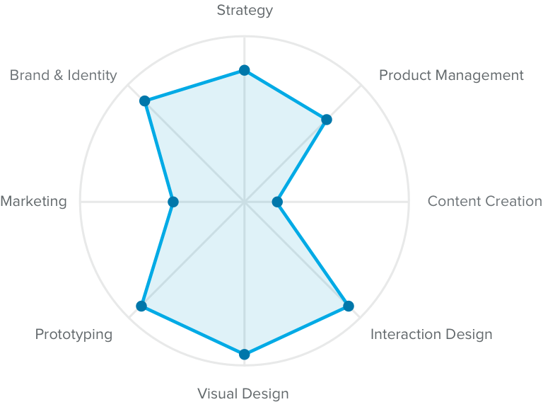
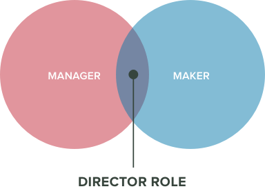
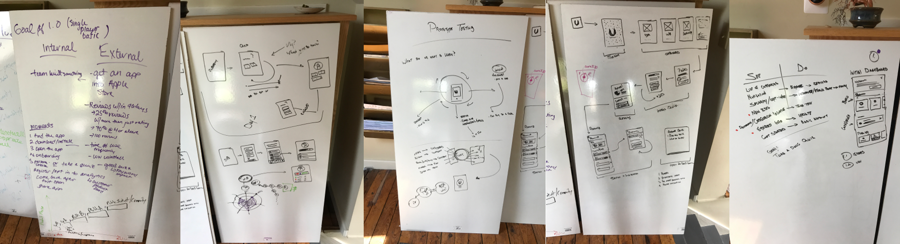
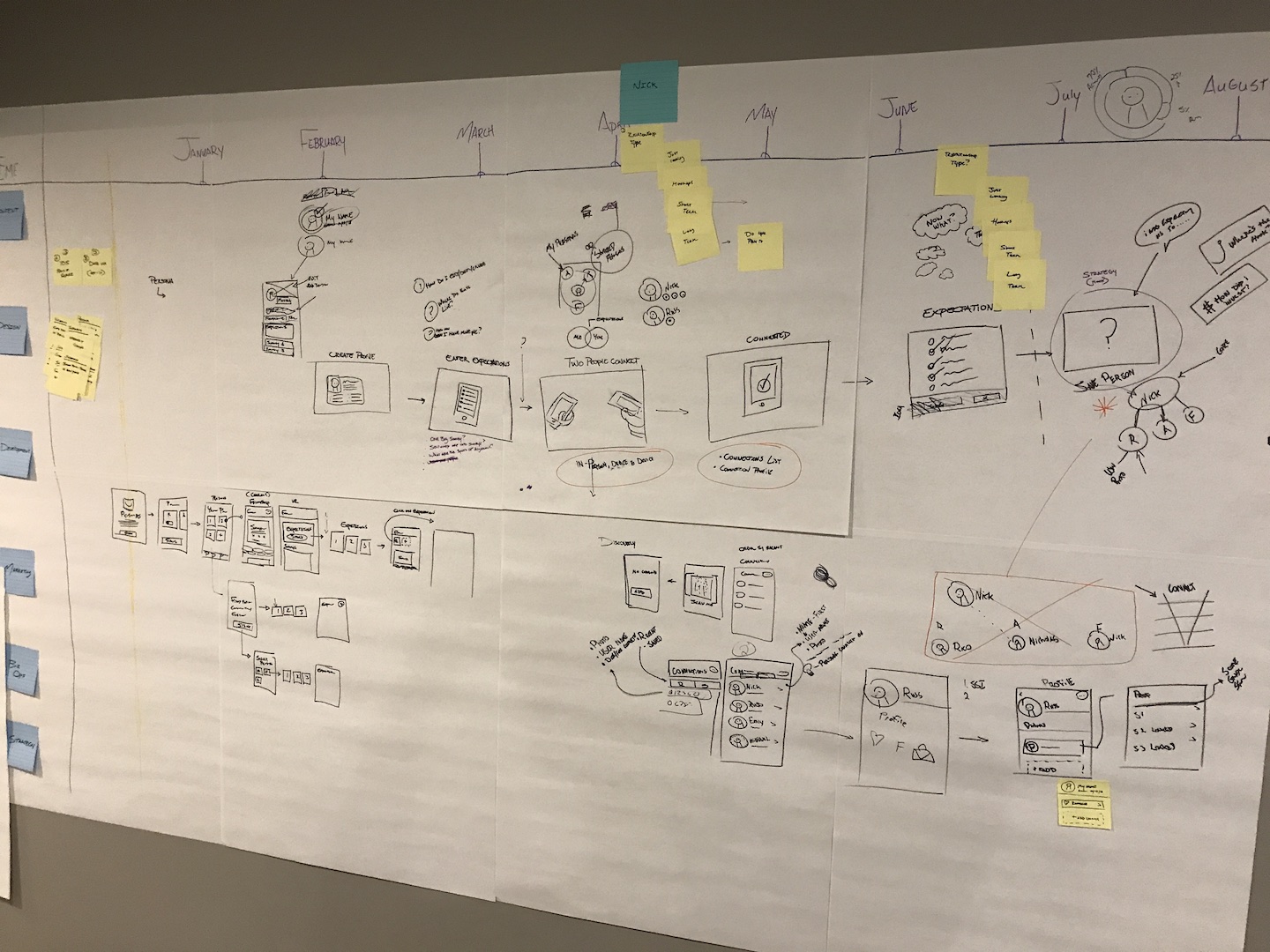
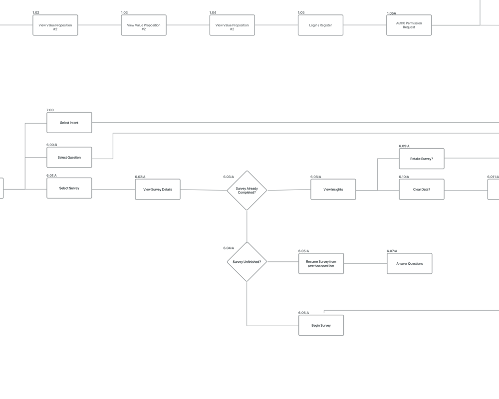
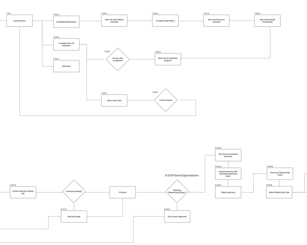
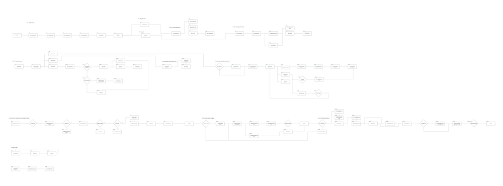
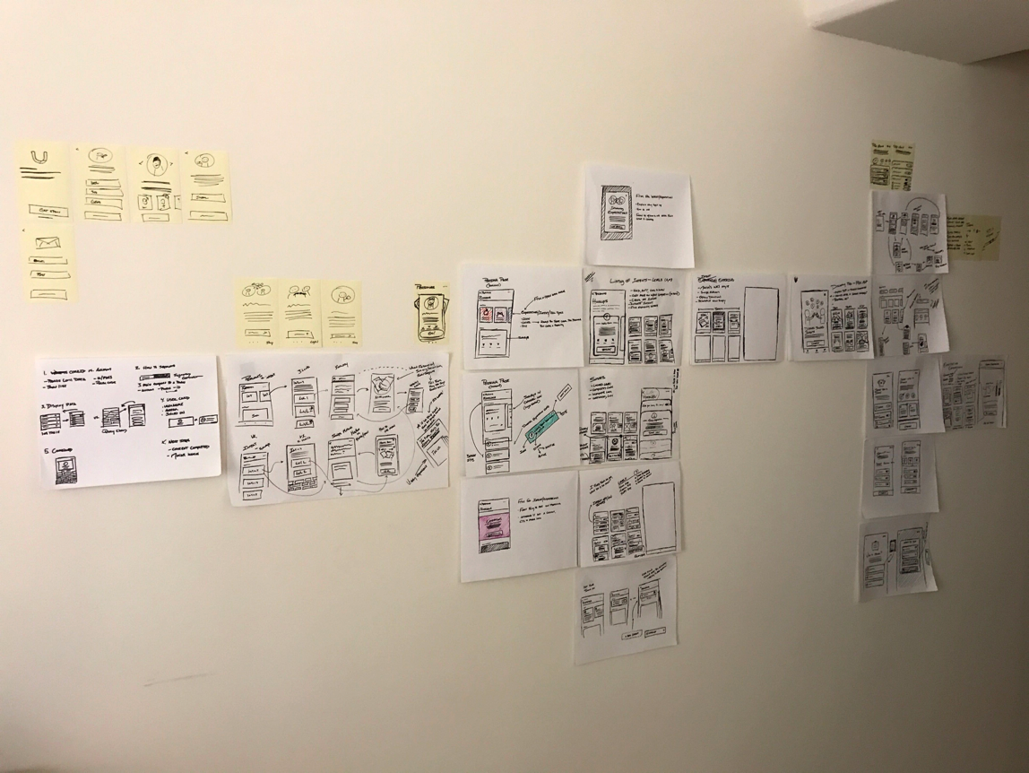
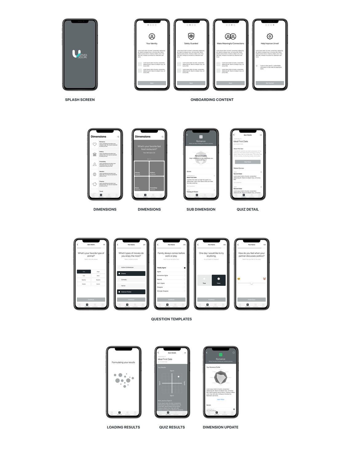
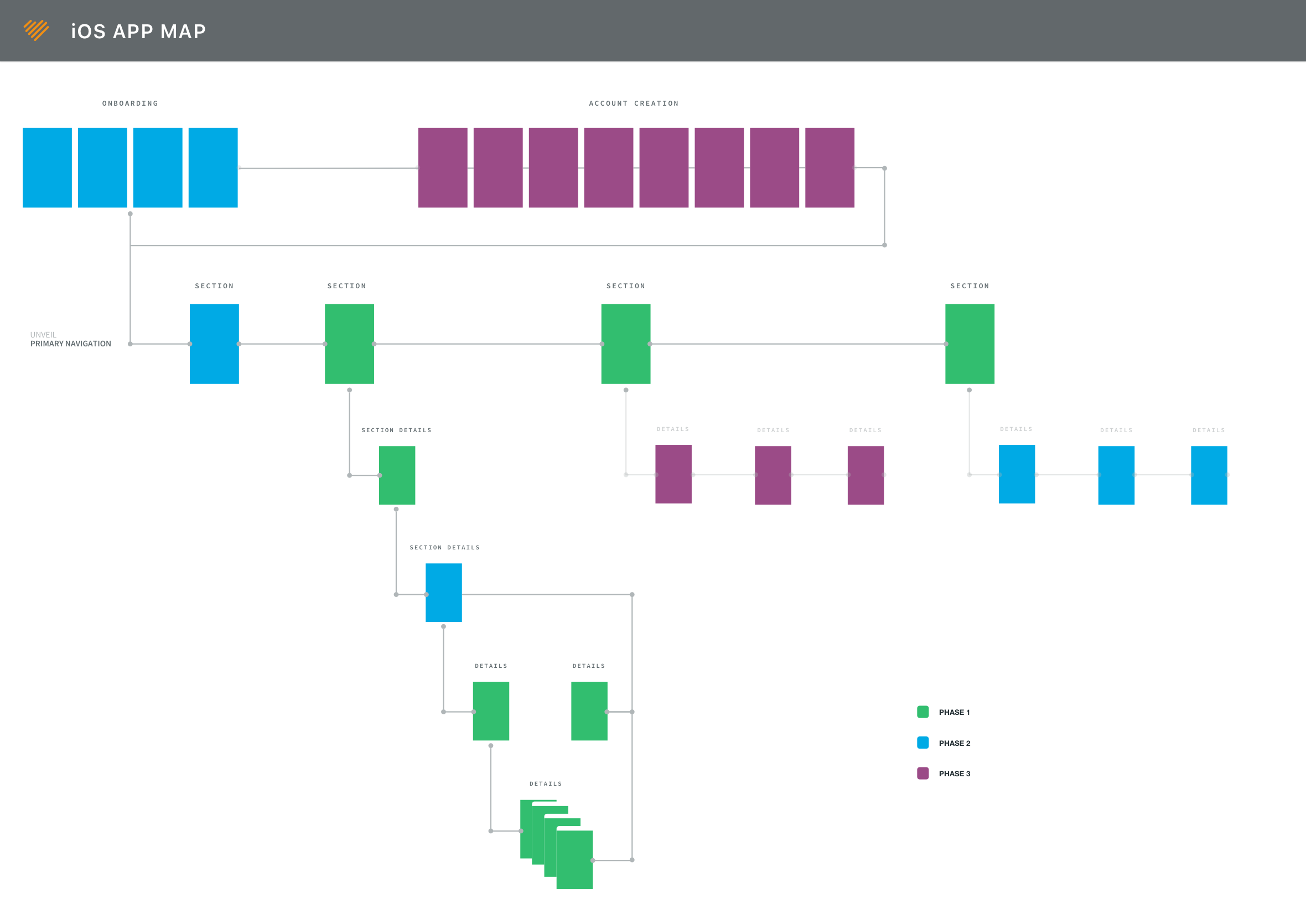
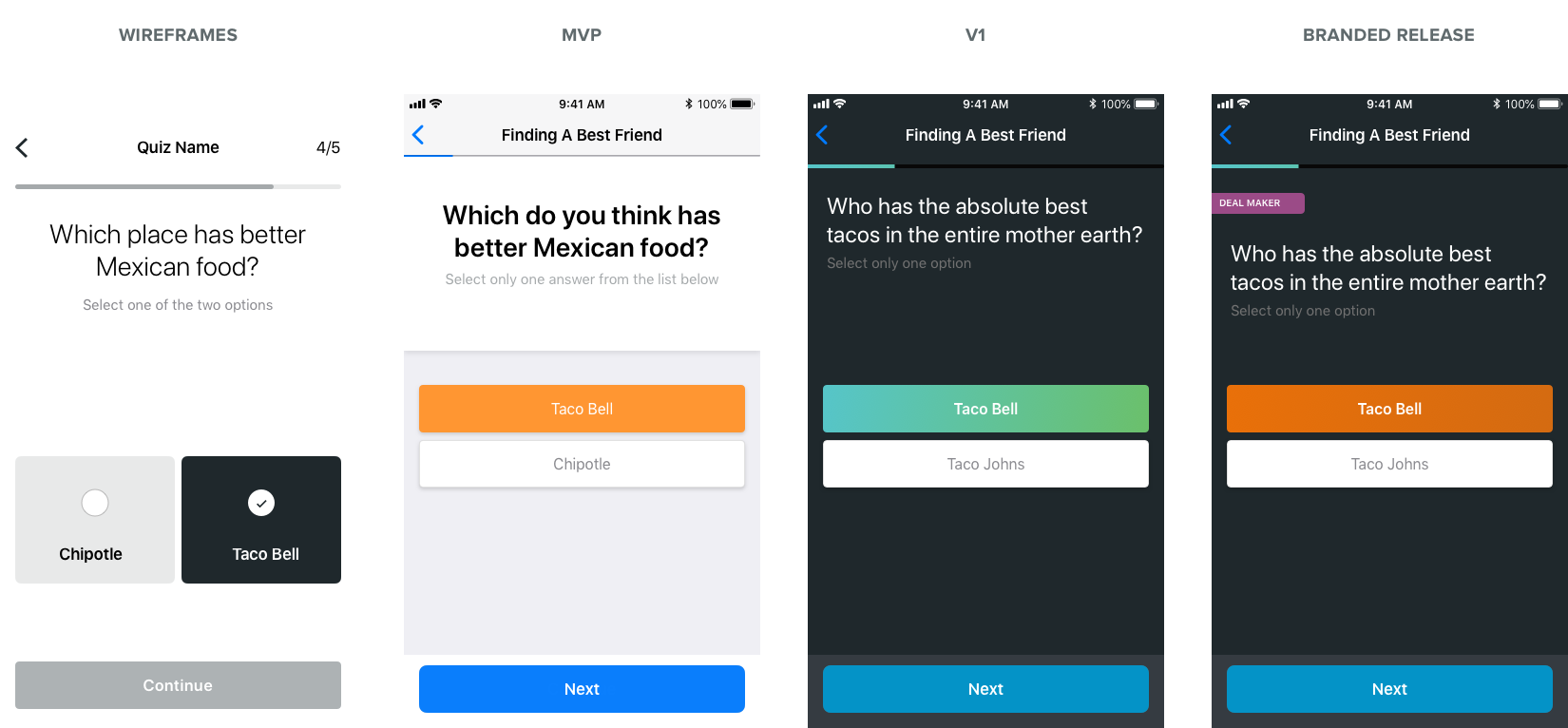
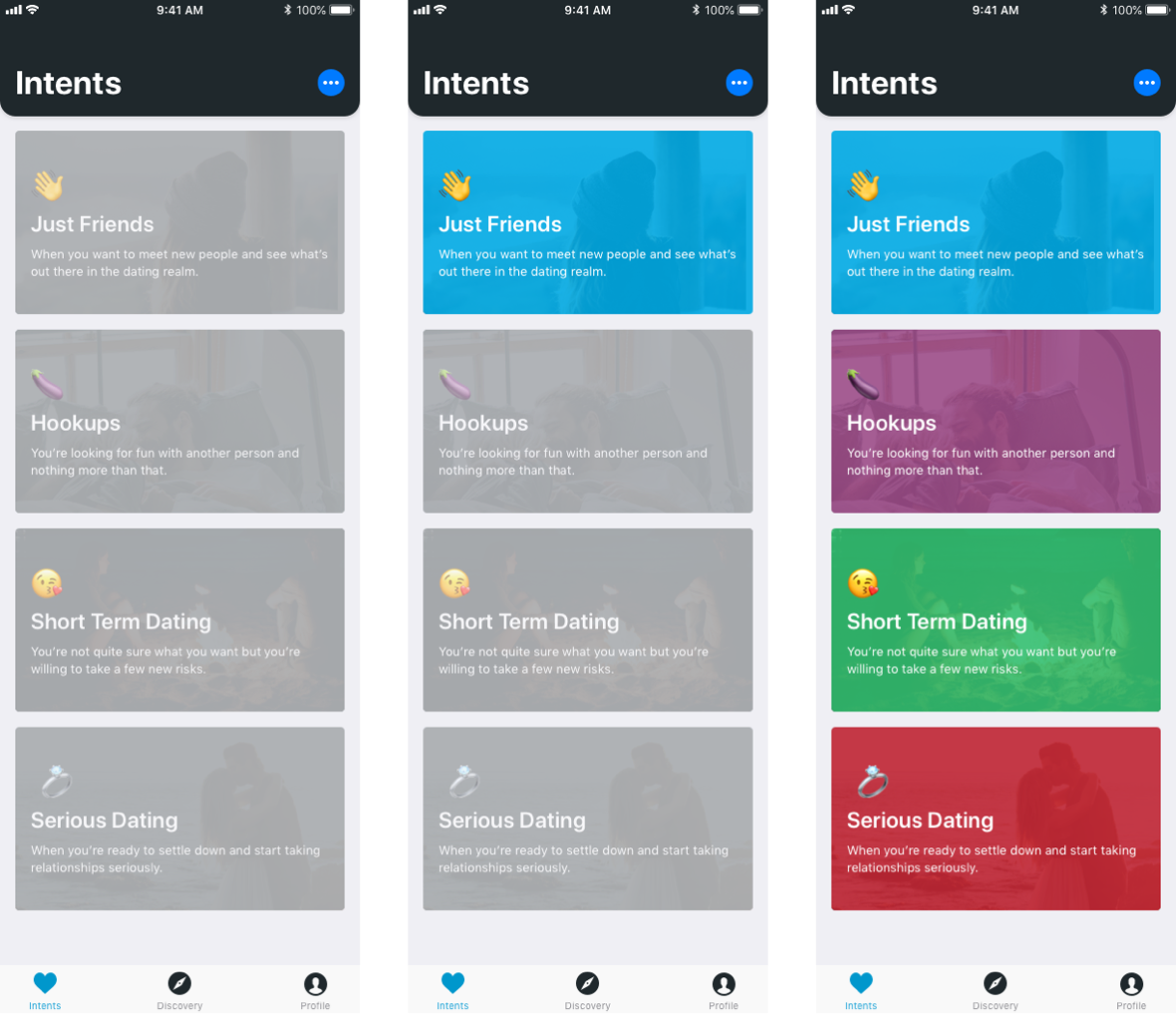
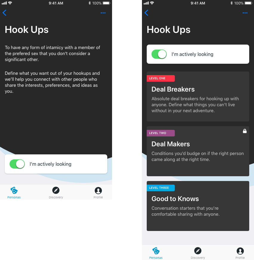
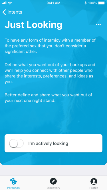
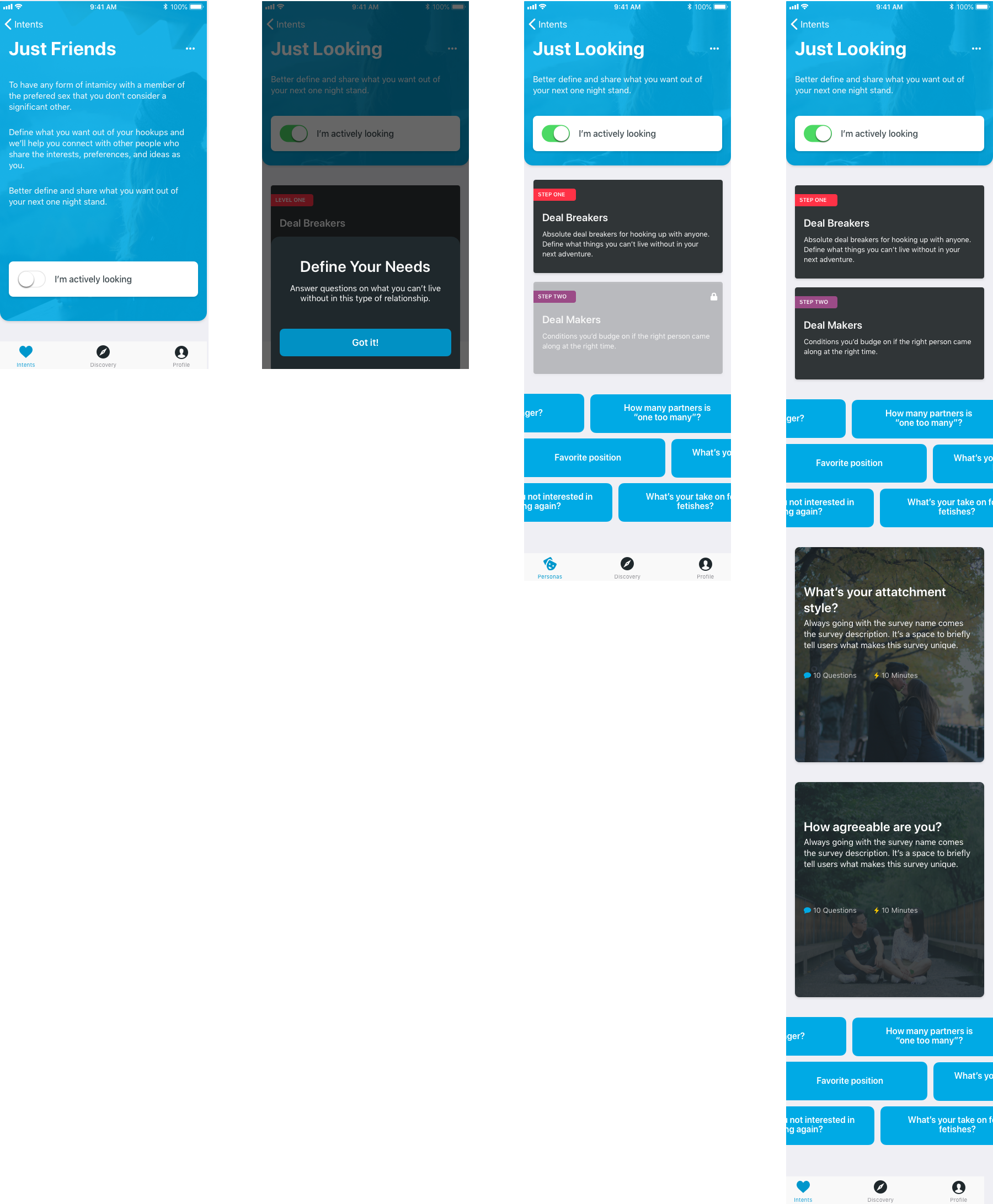
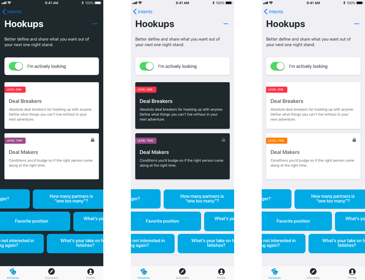
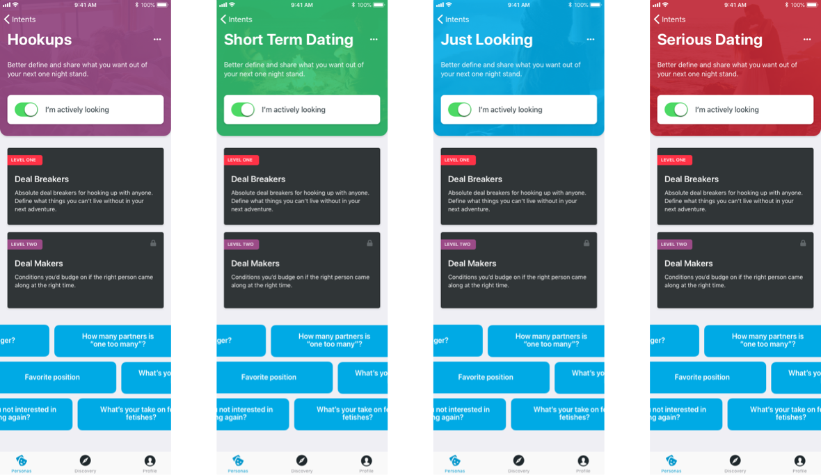
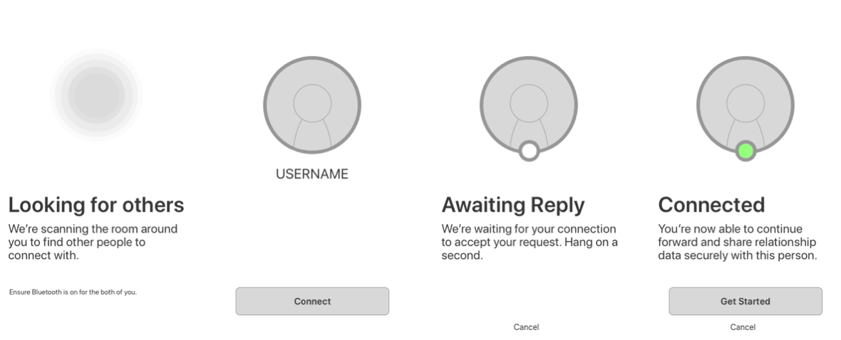
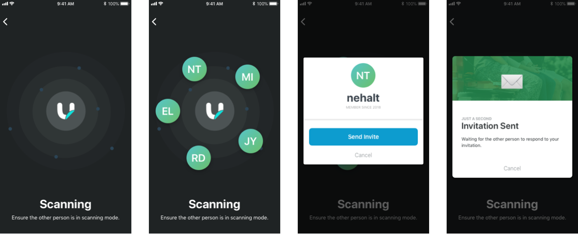
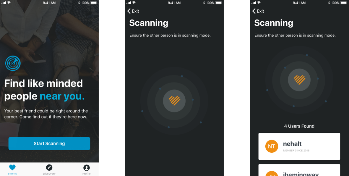
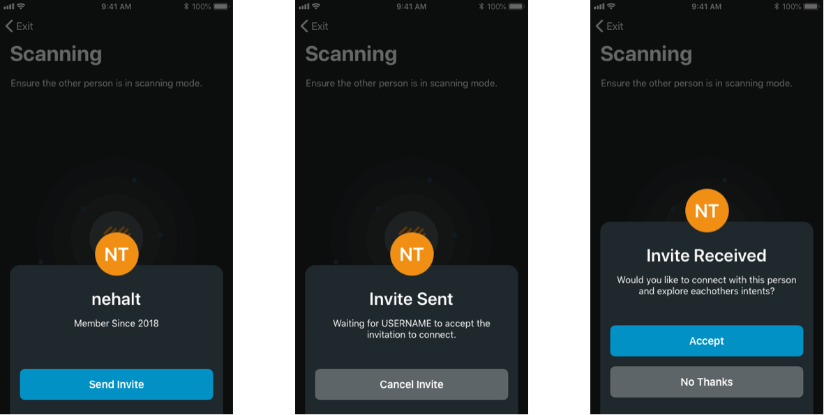
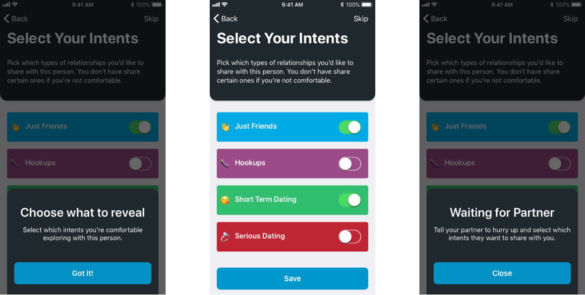
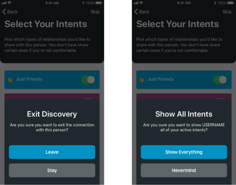
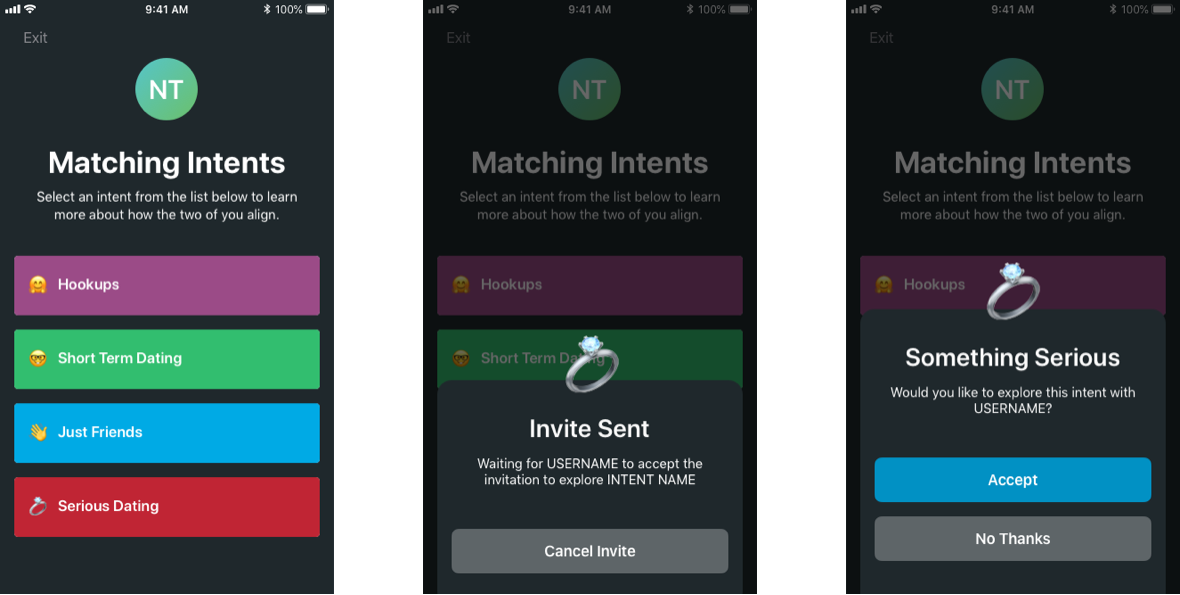
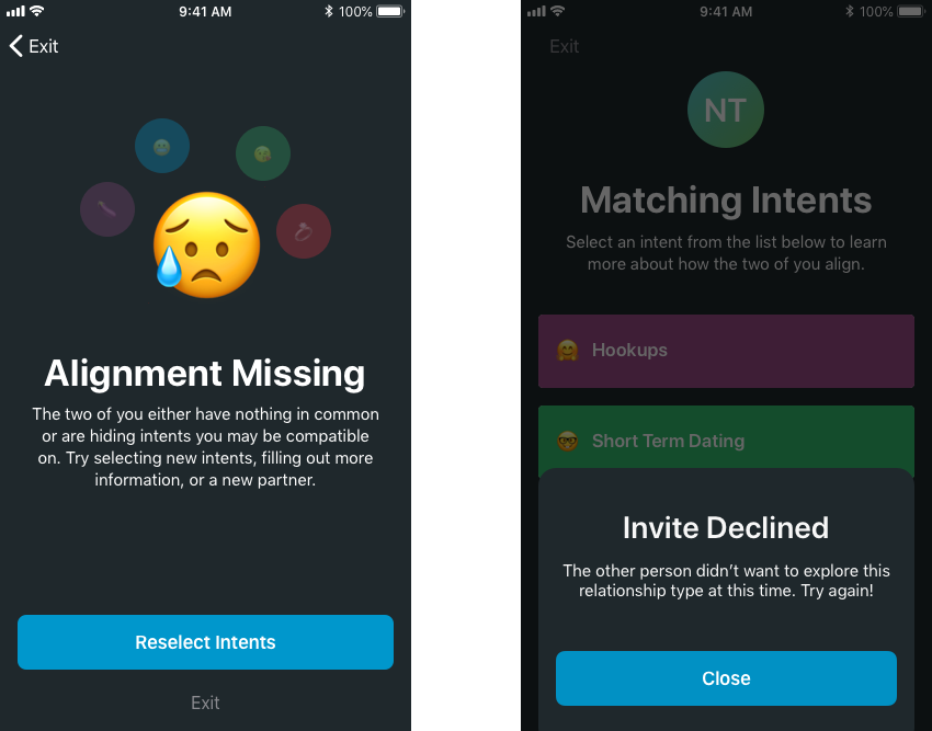
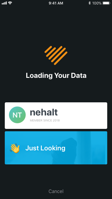
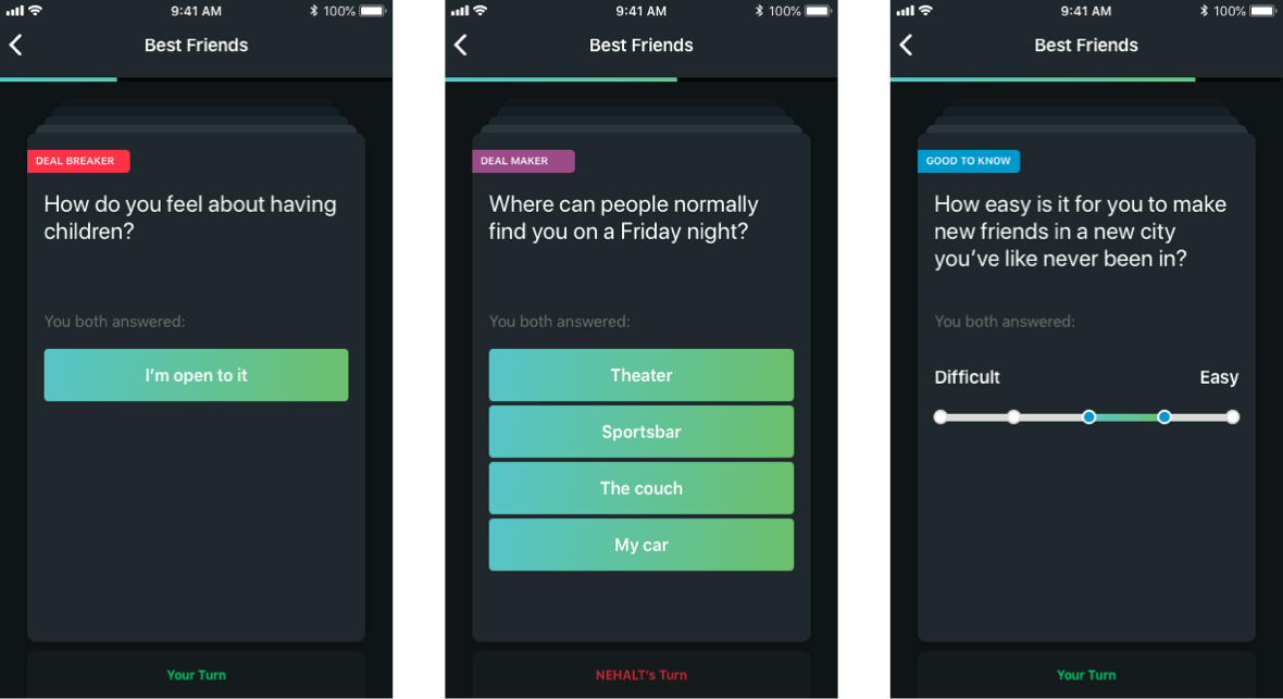
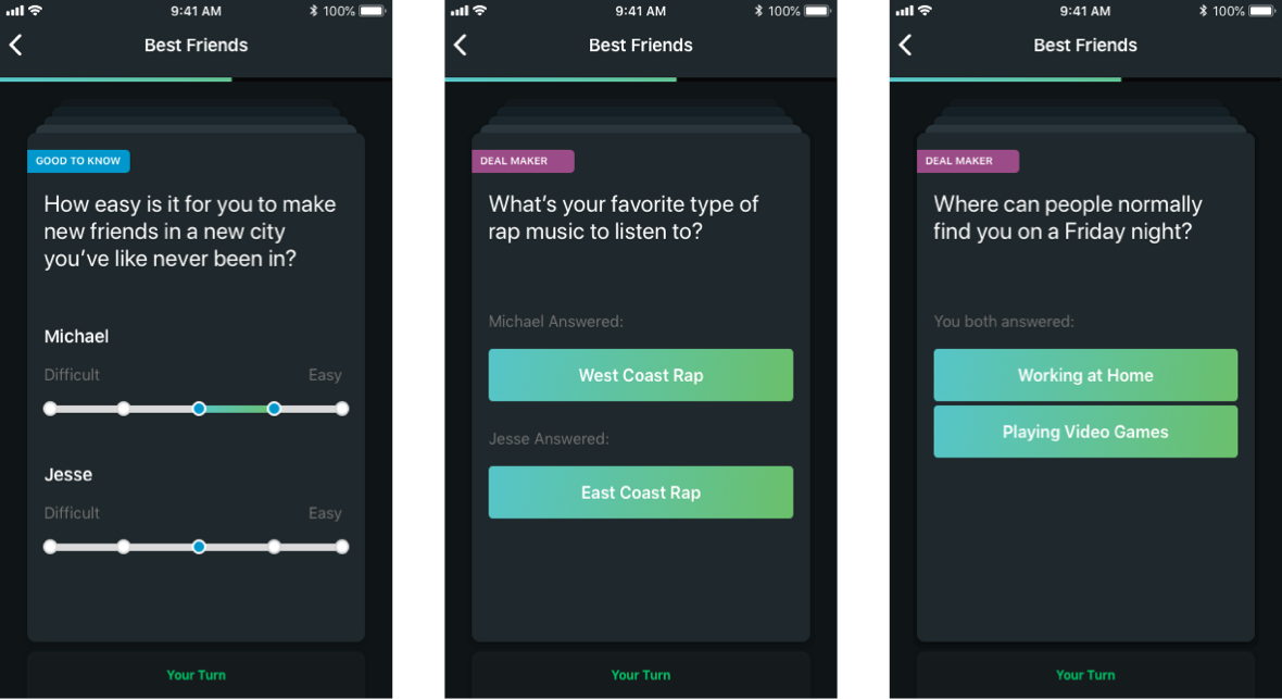
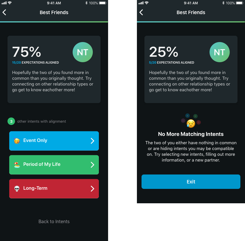
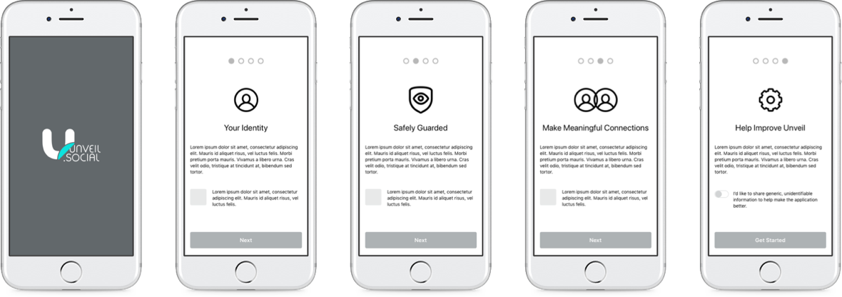
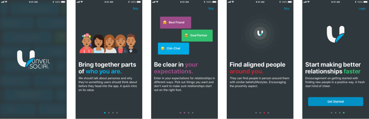
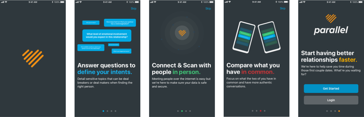
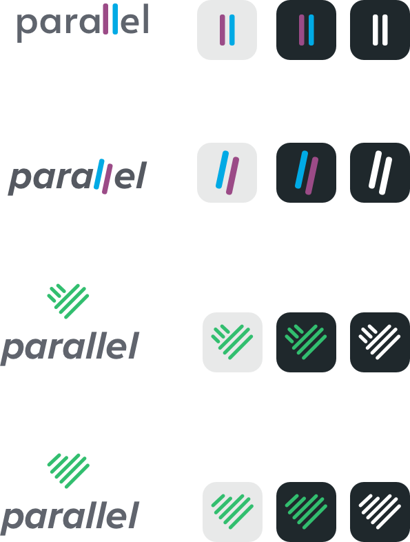
I started with Unveil as a contractor, thinking they had most of their ducks in a row and I could help them refine some ideas and send them on their way. That wasn't the case as this was their first rodeo. My role quickly grew into product lead/manager to help introduce design thinking and ways to build an app in a modular way. I really enjoyed the variety of work, from helping define features to designing the logo, as it kept me quite busy leveraging a lot of my tertiary skills that normally don't get used.

Keeping a Balance

When I approach the design of a product I inevitably have to ask questions about goals, expected outcomes, and definitions of done. Before I can make anything I need to know what it is we're building and usually that takes a lot of effort. Once we clarify those elements I'm happy to put my head down and go into production mode to have something to show and point at later. When you're working with defining the project but also produce, you have to switch between this maker and manager mode daily.

Maker & Manager

Jump into Workshops

The best way to get everyone on the same page is to put one big page infront of them and have all the ideas laid out. I was constantly facilitating workshops to get the team on the same page and define features, goals, and timelines. A small team needs structure and it drives me nuts to see people build things without a clear direction/goal.

UX Workshop
UX Workshop

Feature Definition

As the designer I can't sit back and assume what "connect with another user" means and start creating hypothetical, aesthetic visuals for what could be; I have to dive in and ask the tough questions that make me sound like an asshole. "How would that work exactly?" and spend hours, days, and even weeks drawing out concepts with the team to define exactly how a feature would work from how a user would benefit from it down to what's technically feasible.

I work through these by doing process flows which lay out every step along the way for each feature. Working in a modular way lets you compartmentalize different ideas and connect them in different ways, but most of all keeps your team focused on how an idea would work before how it would look. Here's some examples of the diagrams produced from this:

Proccess Flow Snippet
Proccess Flow Snippet Again

All of the flows together creates quite the map of information; it shows all pathways from the app as one big network. I love having this document for when onboarding new members to the team no matter their role, they can fully understand the app and how it works. Often we get new ideas every time we bring someone up to speed and learn something new.

Proccess Flow Zoomed Out

Visualizing Flows

Typically after a workshop I can come up with a prototype using Invision to tell a quick story to the stakeholders on what I'm hearing their app should be. Below are the series of wireframes I created at a high level after the workshops to guide them through. The flows being done means leadership and development is in sync; now it's up to me to define the order what we work on and the specifics of the UI.

Sketching Initial
Wireframes Initial

Release Planning

When all the sections are built out in detail for both leadership and the engineering team I'm able to craft some user experience map together for people to zoom out once again. With that we can look at the big picture and decide what should be worked on first, second, and last. This is an example of a "sitemap" I made showing the different areas of the app connected together to reflect effort and dept.

Sitemap Phases

I used color coding as well to dictate which sections of the app would belong to each release as well. This helped the founders understand what was most critical for a minimum viable product for them to get started right away.

Product Management

It's easy to get overwhelmed when sizing up a new idea. Over the years I've learned how to dissect ideas into pieces and work them out individually and then combine them later to paint a bigger picture. Painting this picture from a high level of all the moving pieces is key to getting stakeholders to understand how it all comes together and how many moving parts there really are behind the scenes. In this example I asked the team to define a state in the future they want to reach and work backwards together from there to understand the path.

Project Timeline

As time went on and teams got bigger and features became plentiful, I would work out timeline views like the one below to communicate to the team what everyone's working on and what they can expect when. I love doing this because it's far more effective than a spreadsheet that's too verbose or a long winded email; it paints a picture that can be evaluated quickly.

Breaking things out into swim lanes by department and then color coding each feature/goal helps communicate what's priority and how one team needs to finish something before another team can use it to begin their own work. This is an example of a later roadmap used for the product. (with the details stripped for privacy)

So how does it work?

The flow of the app is pretty simple but the devil is in the details. At its core we want people to be intentional with others and to start there versus having people be unsure of what they want and in turn being unsure of who is a good fit for them. They fill out information on each type of relationship they'd like to have and then go on to compare answers with others to see if there's compatibility between them.

Parallel App Flow

Tools Used

I've been using Sketch for a long time and have built a lot of muscle memory with it. No, I don't use nested symbols or a complex design system. I'm one designer working with a never ending stream of ideas and responsible with creating something visual to turn around and present/test quickly. I've worked in large organizations where I've planned, built, and maintained a massive design system but for startups it's not productive for the clients budget. With seeing the trends for Figma, I plan to learn that in the near future.

Sketch Icon

Design Approach

The way I approach mobile designs is to use the smallest screen size as a constraint, such as the iPhone 8, knowing that if the interface works that size it can easily scale up to something like an iPhone X without problem. The client on this project was adamant about a dark interface for the app as users would be comparing their information via the app in dimly lit places like bars, concerts, and so on. I purposely used iOS components and patterns for this product due to the lack of an existing brand as well as my own branding skills. The goal was to expedite development, use known patterns that are accessible, and hurry to the market for validation of the concept. Below you'll see my journey in making that happen.

Phone Icon

Capture User Data

How do we know what you like unless you answer questions about your interests, tastes, and preferences? I designed a few ways for people to respond to questions in the app.

Designing Question Types

Getting users to put their data into the app is the first step to doing something useful with it. I was tasked with creating gimmicks, input forms, and different methods for users to answer questions about themselves.

Input Data

To understand how two users can be matched up first we need to gather information about them. I worked with a brilliant developer to define a few major types of inputs for different types of data sets. We worked together to build out requirements for each type that looked like the following:

User Input Methods

There's a lot of ways we can ask for information from users, but the development team urged us to narrow it down to something to test out with users before gold plating the app and the backend. This was a good constraint especially for the content team to create questions with some restraints.

Question Types

Narrowing it Down

There's a lot of ways we can ask for information from users, but the development team urged us to narrow it down to something to test out with users before gold plating the app and the backend. This was a good constraint especially for the content team to create questions with some restraints. I refined the concepts using iOS components to whip something up for us to test internally using Sketch, Invision, and Principal App.

Single Selection

Selecting a single option, the most basic way to query the user. When the user selects an option the action button at the bottom slides up. If a user selects a different option the selection changes to that choice.

Binary Choice
Binary Selection
Binary Selection Updates

Binary in Production

Towards the release of the product we increased fidelity with the brand and this was the result. Not all of the smoothing was settled in this example.

Mulitple Choice

Multiple Selection

Reusing the same pattern as for single selection users can select multiple options. We also limited this on some questions too; only allowing users to pick two or three options.

Mulitple Selection
Multiple Selection Update

Polyadic in Production

Towards the release of the product we increased fidelity with the brand and this was the result. Not all of the smoothing was settled in this example.

Range Selection

Sometimes how you feel about something is on a spectrum. Users can use their fingers to drag the slider to increments between the two spaces.

Sliding Scale
Range Selection
Continuum Selection Alternative
Continuum Selection

Micro-Interactions

The devil is in the details; I work a lot of developers to help define the small interactions such as "should the slider snap to a dot? At which point does the handle come back to its current selection?

Range Select in Production

Towards the release of the product we increased fidelity with the brand and this was the result. Not all of the smoothing was settled in this example.

Interface Evolution

As you can see above the progression of fidelity increased as time went on and more and more interactions were created. I focsed on the bare bones of the components and as we started more and more testing we added more flair to the designs. It was a good way for us to know if the foundation was solid before making tests too complicated with subjectivity involved.

Wireframe progression

Differentiating Data Types

When building out the back end and working with the content team we recommended some questions be orphans in the graph database to allow users to connect on items that aren't seemingly related. "One Off" questions, or single queries, are random bits of information that can be linked any which way. Surveys are a series of questions that can be asked in a related sequence and provide an insight at the end.

"One Off" Single Queries

A single question in space. What's your favorite color? Where do you love to go on vacation? None of these questions are interrelated but could help you find someone with matching traits based on one of these odd questions like where you grew up.

One Off Icon

"One Off" Questions

I came up with the concept for asking users for a single data point in a way that's unobtrusive and clearly shown so users know they've answered it. We wanted to collect a lot of data that was pretty blatant but didn't have much of a place for it; like "what's your biggest fear?" or "tacos or burgers?" as examples. The initial states look like as follow:

Query Bubble

Questions without Categories

I came up with the concept for asking users for a single data point in a way that's unobtrusive and clearly shown so users know they've answered it. We wanted to collect a lot of data that was pretty blatant but didn't have much of a place for it; like "what's your biggest fear?" or "tacos or burgers?" as examples. The initial states look like as follow:

One off questions

Getting quick opinions

When users tap on a blue bubble it brings up the question with the answers users can select from. When they make a selection and hit save, it collapses and turns green. It turned out to be really successful with users and increased our rate of user input by 35% within the app.

Question Cloud

Bubble Wrap Interaction

When users tap on a blue bubble it brings up the question with the answers users can select from. When they make a selection and hit save, it collapses and turns green. It turned out to be really successful with users and increased our rate of user input by 35% within the app.

Survey Icon

Surveys with Insights

Surveys are a way to ask a series of questions in a row and provide the users with an output that can be compared to others. You've seen these before, the typical Facebook "Which Disney princess are you?" type surveys, but to help you understand your dating style. It could be one of five different results and each question will push you around in a space of possible results. These are good for keeping a topic really focused as well.

Survey Cards

Displaying a survey is like displaying a deck of cards; it's all about the packaging to entice people to open them up. I made countless designs with various imagery, illustrations, iconography, metadata, and so on to show them off in unique ways. The best is what you see below, images with text/icons.

Card Designsfor Surveys

Content Guidance

I helped the content team work through different constraints with the tiles for content and copywriting to find the balance between naming surveys too long and making them appear in a pleasing way. Throughout the app we had to make a lot of decisions to balance this out and it was up to me to lead the way on what works best for the users. Content is king but sometimes if content has no constraints it can run wild.

Card Designsfor Surveys

Expanding Cards

Similar to when you tap on a card in The App Store, the cards on the app here opened to show more detail and a full bleed image as the background. Users could start the survey or scroll down to see more information on the types of questions.

Card Designsfor Surveys

Survey Details

Something about the surveys

Survey State Comparison

Survey Results - Evolution

One of the things I love doing with developers is finding ways to start small so we can validate concepts and keep the team working towards something better in the future. This is an example of the initial design on the left that tells users their survey result in the form of a text description and grows later to showing the point between two spaces, a point in space between four items, a radar chart, and the ability to compare their chart with other friends as well. Building these future concepts is key to showing stakeholders where we need to start and how we're going to make things better in the future.

Product Design Feature Evolution Progression

Relationship Intentions

Before the user can do anything they need to define which relationships they're looking for specifically. Each intention has different series of questions for that topic; users have different criteria for one night stands than they do for marriage. The pattern here is; users select an intent, toggle it on, and then can fill out questions around that intention, then connect with others on that intent later if they choose.

Start with Intentions

A single question in space. What's your favorite color? Where do you love to go on vacation? None of these questions are interrelated but could help you find someone with matching traits based on one of these odd questions like where you grew up.

Relationship Intents

Animated Intents FTUX

For the first time user experience I wanted to hit users with something informative but also have something more over the top to set the tone for the rest of the app. This was done in Principal while doing motion studies for the app on other pages.

Relationship Dashboard

The dashboard for Parallel is quite basic in MVP, it shows all the available types of relationships and which ones are active for the user. I tried to use specific colors for each intent so users could remember which intent they're on as they're within filling out questions. Using color is a risky move with accessibility but I also used photography which I learned through this project can be just as difficult as it conveys too much information.

Dashboard Progress

Toggling On/Off Your Intents

Users can toggle on and off intents they're currently looking for as time passes. Some people may look for only a few things whereas others may have all turned on. By activating one you move to the next level of diving in to define what about that intent you're looking for specifically.

Toggling Intentions

Activating an Intent

When a user taps on an intent in the list I wanted to introduce it and give the users more detailed information in a more engaging way. This animation made it to the app at a later time when assets could be combined with it, similar to the example below.

Alternative Concept

I tried another method to help developers show a method to utilize a new concept with the images growing instead of a generic background.

Alternative Activation

Managing Intents

When an intent is activated users have to fill out certain information before others to lead them down a narrated path. Each element can be interacted with and will change in appearance later when the users answer questions within. Users can see at a high level how much information they've filled out for that type of relationship.

Defining Intentions

Activation Concept V2

This animates what the user experience is for activating a new intent, being shown the information about that intent, and then the user returning to the dashboard to see their new intent activated at the top of the list.

Detail View Concepts

These are a few examples of light, dark, and colored designs I tried and tested with the team. I really liked the latter version of this but the team later liked more distinction will color from one intent to the other.

Intent Versions

Intent By Color

Although this isn't accessible, the team enjoyed different colors for each intent. This does limit how many intents you really can have to less than 10 items, but we decided to move forward with it and check reception from users later. Could they remember each intent simply by its color?

Intent Colors

Encouraging Completion

One of the goals I had throughout the app is trying to make the content easy to enter and keep people wanting to add more and more. Unveil wasn't interested in capturing user data for any nefarious reasons, but the more a user enters the more they'll be able to compare with other people. The video here shows someone answering all of the questions for the single, random questions within one category and is presented with a little "congrats" message after finishing the whole category.

Connecting In-Person

Instead of comparing data over the internet, it has to be done in person on a date. The app uses Bluetooth to create a secure local connection and let users pick what they want to reveal. Once they agree upon a shared intention they walk through each answer together to see that they both share that same view/opinion/preference.

Scanning Nearby

With security being top of mind, users have to connect in person instead of over the internet. The founders stress this as a "dating" app, meaning you use it while you're on a date, not to find dates. When users are in person they can open the app and search for eachother via Bluetooth and send an invite.

Wireframes Connection

Initial Concept

We all met and agreed in a series of workshops that the best way to go about finding other people is the solution below: scanning the area nearby, waiting for someone to pop up, selecting the person, connecting, and then moving on to the next phase of selecting what data you want to share. Remember, users don't have any photos nor do they want their names to be shown publicly.

Early Concept of Connecting

Final Concept

Higher fidelity and incorporating the new brand makes this concept much more appealing. An intro screen to set expectations, a scanning state, and the ability to show a list of people without it being overwhelming or underwhelming.

Dating app Connection Local 1
Dating app Connection Local 2

Scanning Animation

When users are searching for eachother we show this pulsing animation to indicate something is actively trying to work in the background. I tried many different ideas for scanning but this one was the most impactful with users to encourage them to wait.

Dev Tests

I was able to work with the best iOS developer in the world, Jesse Hemingway, through the process of testing out multiple connections and connection security. Together we accounted for what happens if multiple people try to connect at once, conflicting connections, and even spoofing attacks.

Sharing Information

Now that users are connected they need to select what information they want to share then view it together in person. We spent a lot of time thinking about how to keep things private but also allow people to change things on the fly incase they weren't feeling the vibe of the date.

Deciding what to Share

After users connect they have the ability to select what types of relationships they're willing to share with that person. Say you're on a date and you can tell you don't want a sexual relationship or long term relationship with that person; here's your chance to avoid those conversations. Each user selects which relationships they'd like to explore with the person across from them.

Selecting Options Intents

Users also have the ability to show all information incase they want to roll the dice and let the other person see everything. And of course they have the ability to exit as well.

Selecting Options Intents

Matching Topics

After each user selects what intent they're willing to share both users see a list of intents where there are matches and only those. The users can tap on an intent from here and invite the other person to go through that topic in great detail.

Selecting Options Intents

Sad Paths

What happens if neither person wants to share the same type of information? What if the connection is denied by the other person? What if the Bluetooth connection is dropped? There's a lot of things that can go wrong that we had to watch out for and test along the way.

Selecting Options Intents

Loading Screen

A surprising add to the flow was this loading screen after selecting your topic of interest. Without it users thought it was too fast to load and it felt abrupt. Adding this screen in helped them feel like something was happening, something more formative behind the scenes and helped keep the momentum.

Relationship Intents

Comparison Types

Users can see only the answers they both share a compatible

Types of answers to compare

Additional Cues

Users can see only the answers they both share a compatible

Types of answers to compare plus more

Comparison Process

The card system was a hit with users going through their shared answers. It's a similar paradigm from Tinder so people knew how to use it right off the bat. We had to add stops between answers to let people take turns and slow down.

Comparison Summary

After the users get to the bottom of the stack they see a summary screen for that relationship type and encouragement to explore the other matching relationships.

Results from Comparison

Onboarding

When the user launches the app for the first time I like to hit them with the main value propositions to remind them what the app has to offer them at a high level. For this app I made a lot of different versions to help educate users in different and more engaging ways with animations and different ways to explain our concepts.

Original Wireframes

To get the team talking I put together wireframes to get them introduced to the way products onboard users by presenting key value propositions. The team initially wanted to focus on privacy, security, and data integrity. I worked with the to better understand what that meant and created a few pages for us to show to people and get their feedback. Did they care about these key points? Or did they need to be clued in to how our app is a bit different than others?

App Onboarding Wireframes

Second Iteration

The feedback on the original version didn't prove to be promising. I went back to the drawing board and created these concepts; the content and the visuals for each slide as well. The end result focused more on the product itself and not the specific features had positive feedback from the team along with users. I used the library Avataaars for the user illustrations. I took it one step further and started to animate the concepts for the iOS developer who loves putting the finishing touches on things and being challenged with these types of things.

App Onboarding Designs Dating App iPhone

Personas Concept

The original concept of users managing multiple personas within the app was confusing to many. We had a lot of trouble explaining to people that they're one person but with many different personalities behind that. I tried my best here to show one character being split up into multiple versions of themselves with differing appearances.

Content & Alignment

The second concept was to show the different types of content within the app to drive home this concept of people needing to be more intentional with their relationships in the app.

Scanning for Users

The scanning screen was well received by users and the team as really driving home the concept of searching for someone nearby. I wanted to feature this during onboarding to intrigue the user right o from the start.

Final Onboarding

Animations are great, but over time the content was improved and along with it the visual elements to refine the new focus of the app being geared towards dating only. I didn't animate each of these concepts this time around.

App Onboarding Wireframes iPhone parallel Dating App

Brand & Identity

Let's be clear, I'm not a graphic designer, but I do like challenging myself with tasks that keep the team moving fast. Illustrator isn't in my skill set so I worked on what I could using Sketch and asked for help from friends who know their salt to help ensure it's up to par.

Initial Logo Concepts

We needed a new logo to pivot the company towards a test app specifically for dating. I helped brainstorm the idea for the name. "Parallel" as in two people finding out if they're moving in the same direction. Here are my initial concepts for the typeface and the logos:

Bad Type Face ideas

Final Version

After a lot of tweaks, usability testing, and refinement we were able to get this concept finalized in a matter of 2 weeks. Somehow the orange color really brought me out of my comfort zone and I was able to to make it work. This is my first logo I've made seriously and I'm really proud how it turned out.

Parallel Logo Light Version
Parallel Logo Dark Version
Parallel App Icon Logos

Logo Animation

I needed help getting the logo packaged up into a proper SVG/EPS/AI file out of my basic Sketch concepts. A friend and former colleague Caleb McGuire helped me work through this process. In the mix of it I wanted to have something branded and stylish for us to use on our loading screens. Caleb's a world class animator and I asked him to help me execute on the idea of these lines animating in and out of a mask. He knocked it out of the park.

Parallel Dating Logo Animation

Landing Page Design

With only a few weeks to spare, I worked with the team to define the goals of having a landing page and whipped something up around the logo to create some loose identity. I'm not a great designer with brand/identity work, but I'm great at inheriting and using ones that are existing. I was able make desktop, tablet, and mobile designs completed and launched at the new domain of: dateparallel.com. I reached out to one of the best front end web developers in Minneapolis, William Fendler, to help with getting the HTML/CSS in place while I focused on other aspects of the marketing realm.

Parallel Dating Website

Open Graph Link

William helped teach me a bit more about modern marketing sites and the new assets supported by Open Graph, especially the attribute of setting which image you want to display on social media or even Slack messages for when someone shares your URL. I came up with this concept to help push the brand in a dark and mysterious sense with the focus being on users scanning and connecting with each other as the foreground.

Open Graph Image

Branded System Emails

Working with the engineers on the signup process using Auth0 initially, we needed some email templates created in HTML/CSS for certain scenarios; activating your account, resetting your password, and so on. I created these pretty quickly and got them into production, it was a massive improvement compared to the default styles the developers were using for them.

Email Templates

App Release/Launch

What better time to launch a dating app than February 14th? We all raced to hit Valentines Day 2020 and hoped for the best.

App Store Submission

Apple quickly accepted the app and before long I was tasked with creating all of the assets to tell the story of the app. I worked with the iOS developer to make sure we addressed all of the App Store requirements for each phone size. It was great handling this process directly with a developer this early in the process to ensure it would get past the finish line.

Apple App Store

Product Hunt Reception

I helped our CEO post on Product Hunt for exposure to the startup community. We caught a lot of eyes from other people building apps in our space and received positive feedback. We didn't get featured for the day but that's ok, we tried our best on Valentines Day.

Parallel Product Hunt

Marketing Promos

I created a series of promos to be used for pushing people to our landing pages. This is an example of one of the promos done for mobile, tablet, and desktop on one platform to help describe and link out to download the app.

Parallel Ad Promos Dynamic

Where is it now?

I left the team after working on this project for about two years and shortly after COVID hit. The idea of people getting together at a bar was unthinkable. The world of dating halted for everyone. The team worked during this moment of inactivity to rebrand the app under the name CanWe and relaunch when things were opening up. They hired talent on the team who could help with the app from a graphic design perspective and actually incorporate a brand into the designs.

CanWe App

I wish the team the best in their course forward, they were a lot of fun to work with and I still keep in touch when I can. The founders were great people to work with and it was a growing experience for me as well.