UX TeamDashboard

With nine user experience designers in three different locations; we needed a better way to stay in touch. This was one of my pet projects on nights and weekends to help keep our team feeling united. Below is a collection of the artifacts and process throughout.

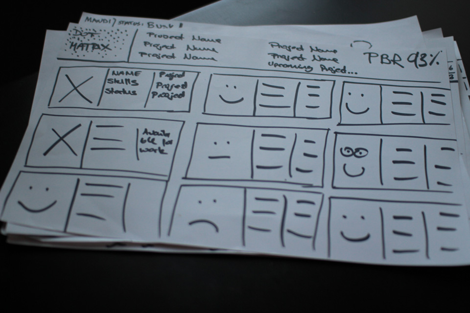
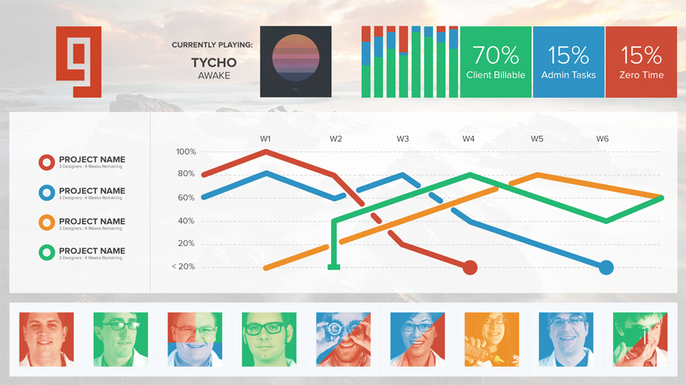
START WITH SKETCHING

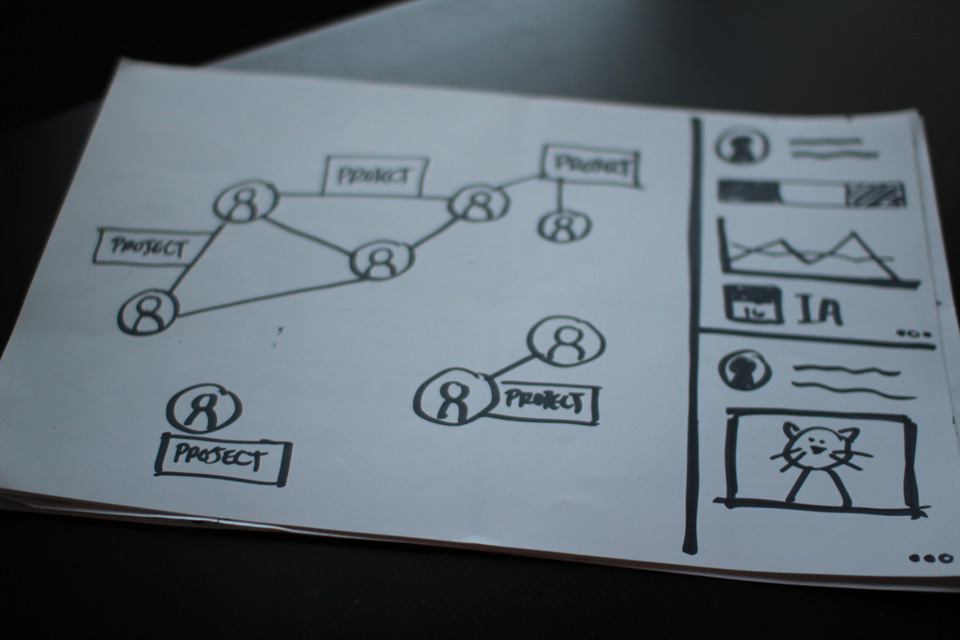
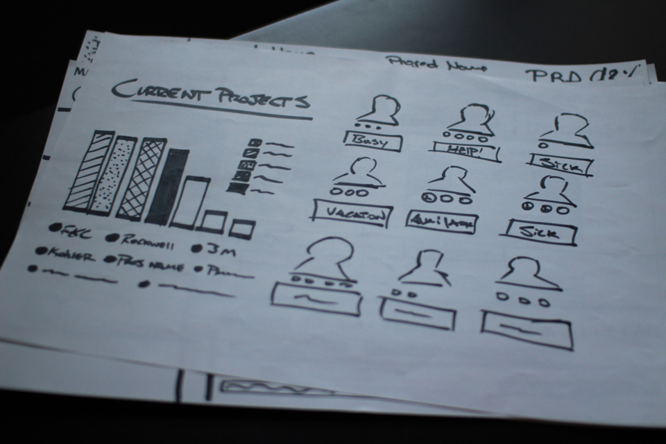
Brainstorming with a team of 12 people can be like herding cats. Luckily we were all able to sit silently for a half hour and sketch our ideal interfaces. I like to have participants, especially peer designers, dive into an 11x17 piece of paper with a sharpie. This gets their initial good and bad ideas figured out before (optionally) pitching it to the team.

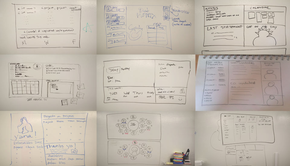
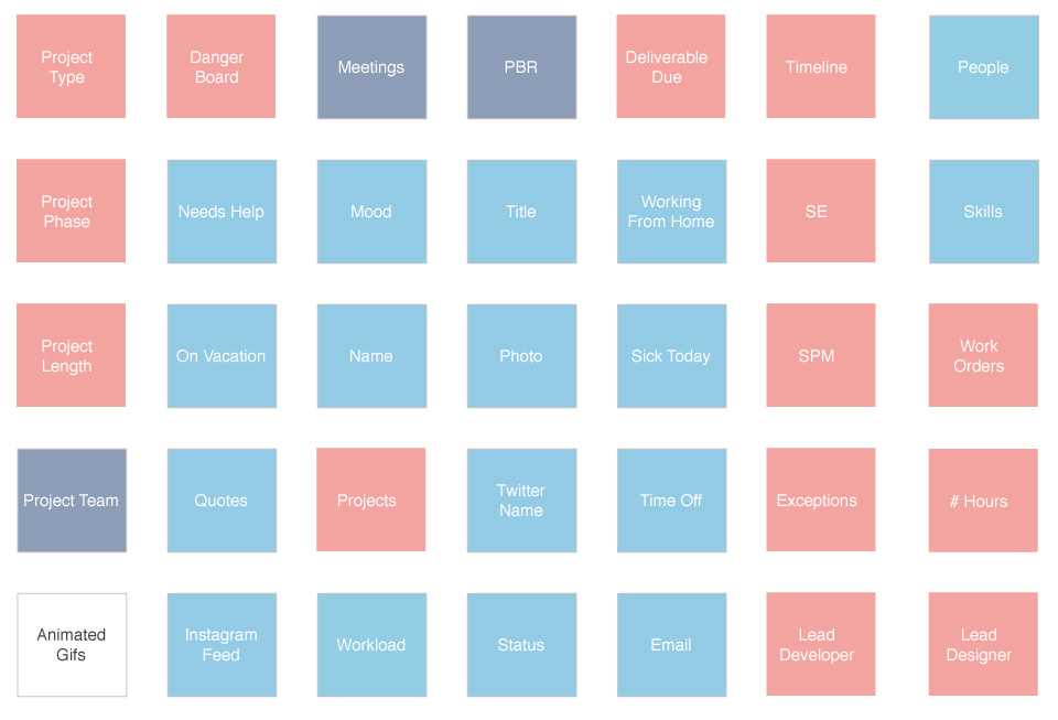
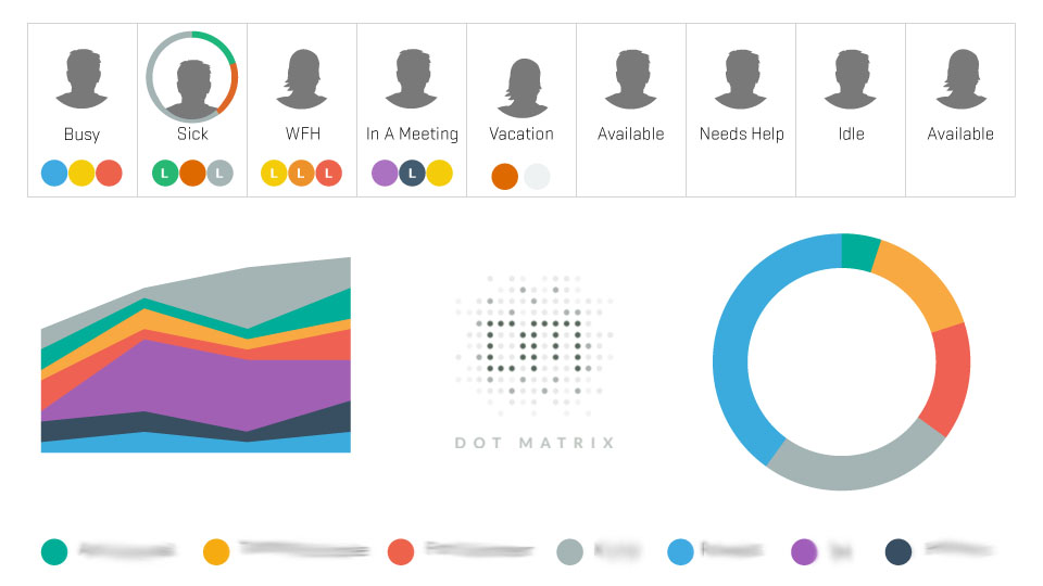
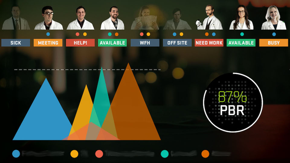
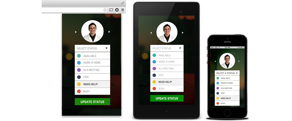
To brush off the layer of aesthetics from anyones sketch, I instructed everyone to write what key elements of information stood out in each of those sketches. Patterns emerged between all designs; animated GIFs and information on peers/projects. The squares below represent the data points seen in all the sketches. This gave us our box to work within. Now to find a box to hook up the to TV.

Hardware

Having a TV without anything hooked up is like a 50" boat anchor. A handful of devices came to mind; AppleTV, Chromecast, Roku, and others. None of these game us a true dashboard, more of a shared tab or desktop.On paper, the Pi sounded like a silver bullet for displaying a webpage without any chrome, cursors, or user input. The reality is the Raspberry Pi is not meant for displaying web apps that use animations, transitions, and so on. This was a huge let down at the time, but the dashboard doesn't require animations to be informative.

Raspberry Pi

With this in mind I personally spent $50 and a weekend to get back into my roots in college; Linux and Networking. Before long I created a web server that displays a page in Chromium's kiosk mode that displayed our team logo and a Twitter feed for a hashtag. It had a huge impact on team morale, despite how low fidelity the design was. People from other teams were tweeting, other departments were interested in the concept, and people had fun putting photos on the stream when traveling.

#dotmatrix

Visualization

Despite our limitations on what data about our company we could access, we sketched out ideas with further rules in mind: Must be readable from 15ft away, Users cannot interact with the information, Data cannot reveal client information, All data must be derived from employees and projects.

Brainstorming with a team of 12 people can be like herding cats. Luckily we were all able to be sit silently for a half hour and sketch our ideal interfaces. I like to have participants, especially peer designers, dive into an 11x17 piece of paper with a sharpie. This gets their initial good and bad ideas figured out before (optionally) pitching it to the team.

When the team had to diverge to work on the daily routine, I started digitizing the wireframes and creating variants of them all together in different emphasis. Here's where we landed before moving into visual design:

I took reigns on the visual designs on this project; selecting the colors, fonts, data visualization types, and so on. In our spare time we'd review the designs together and talk about the technology behind it.

Accessibility

Asking users to constantly update their status throughout the day is a hard sell, the only shot you have is making access incredibly easy. A mobile app was an easy grab, but it needed something more for those who were on their workstations; a Chrome Extension! This was my first time developing an extension for the browser, it was an amazing learning experience.

Real TimeSTATUS UPDATES

When a user changes their status from the mobile version of the web app, or the Chrome extension; the TV updates the status instantaneously from anywhere you have internet.

Scalability

When all four teams have their own dashboard displaying information on each person and project; the data could be aggregated into one large stream to be shown in the main area of the office. The summation of information can help with forecasting timelines, when large amounts of people are unavailable, and comparing to historic data for future planning.

Hierarchy of data structure Hierarchy of data structure

NFC StatusUpdates

Using my Nexus 7, I can tap different areas of my office or apartment to toggle my status with low effort. The sticker simply carries my user id and a designated status that any Android device can push to the web.

Variation

The flexibility of the dashboard framework allowed me to create another dashboard for a new team I was assigned to. The idea is the same, tracking projects and people and the metrics between the two. Below is an example of what I turned the previous dashboard into for accommodating the new team.

Team Glyph UX Dashboard

Related Projects