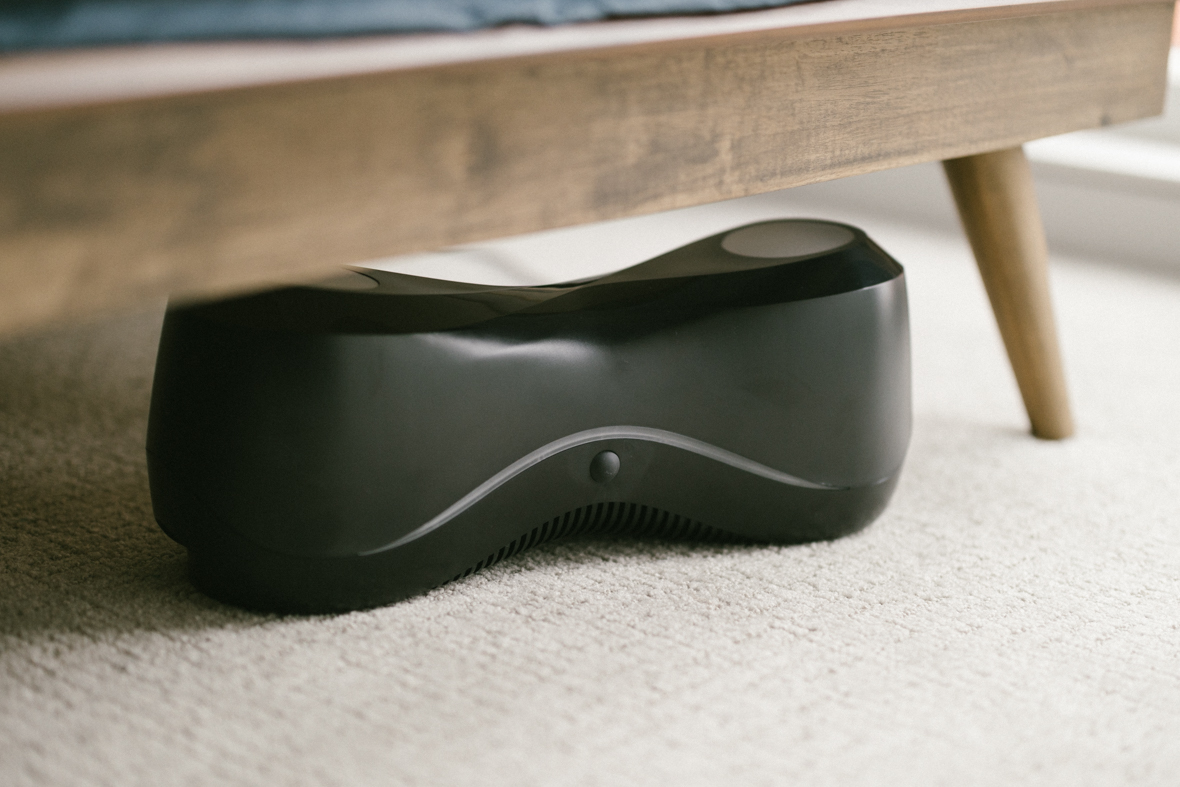
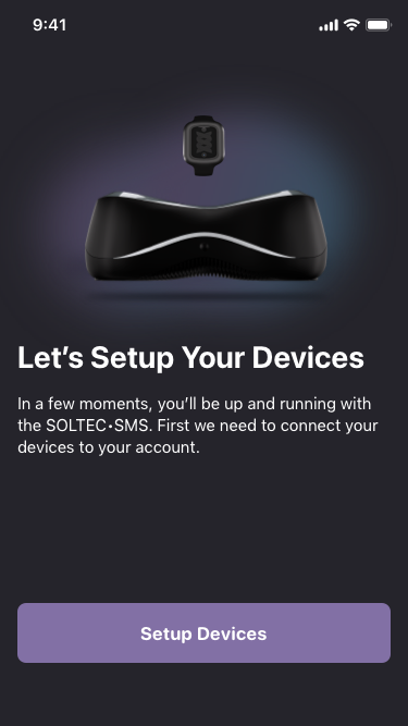
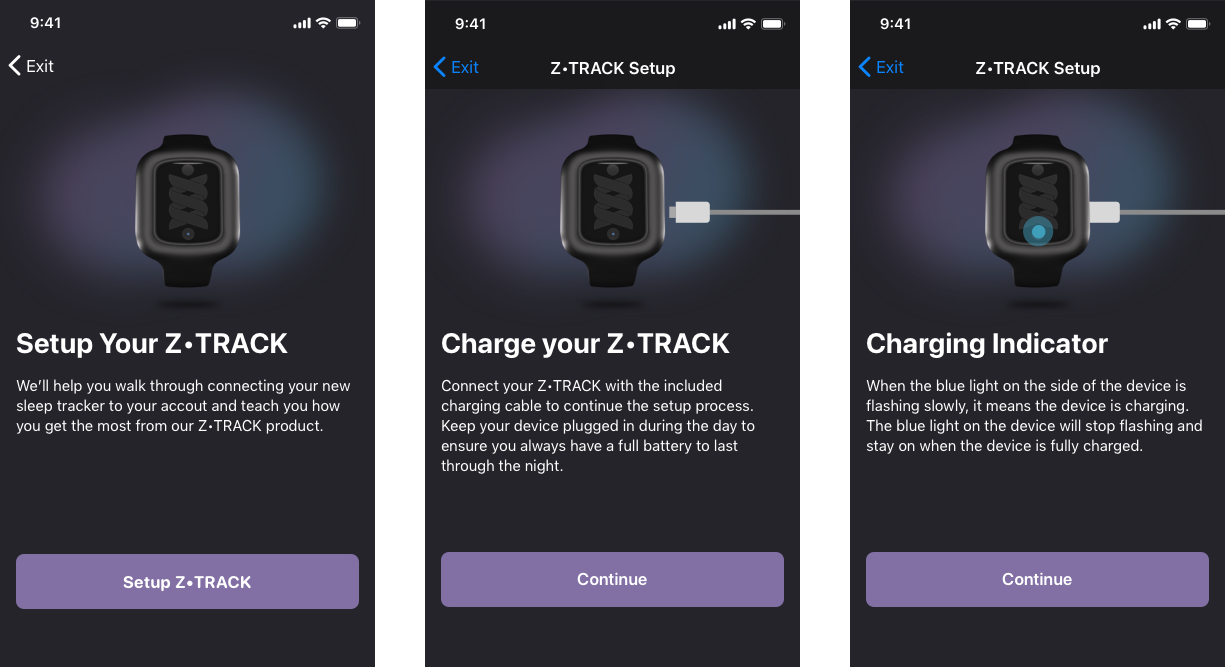
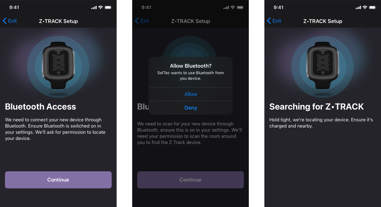
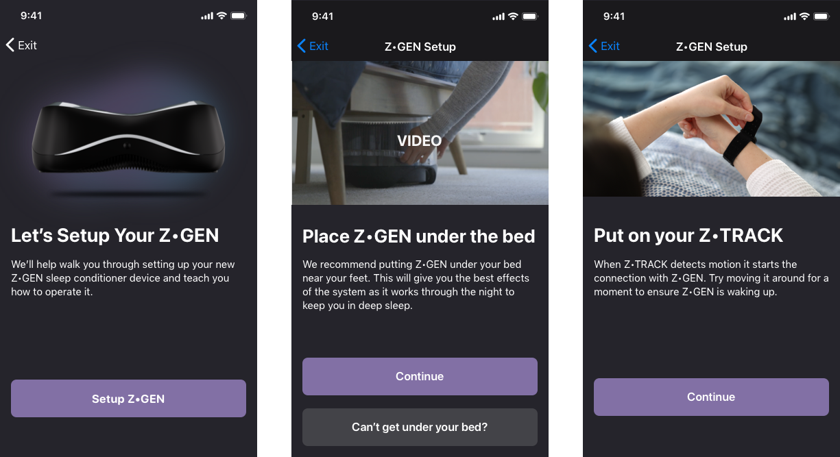
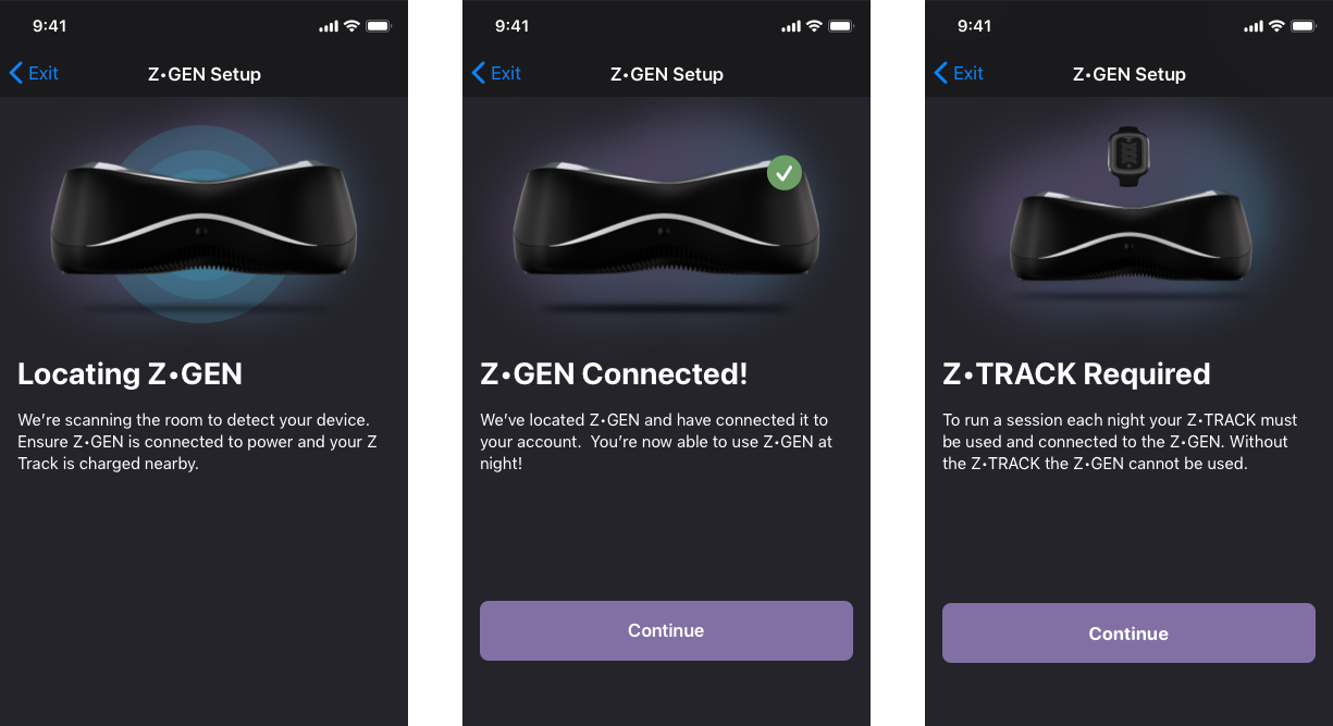
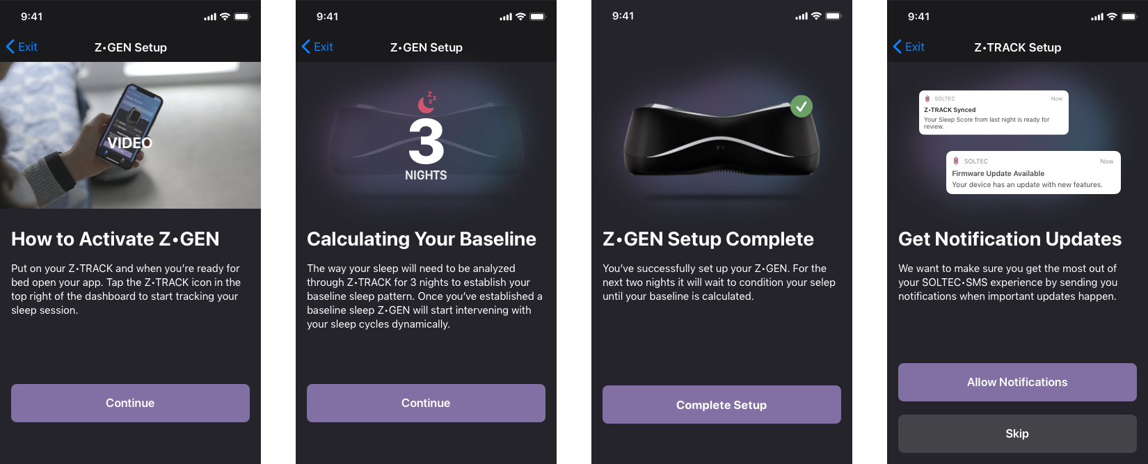
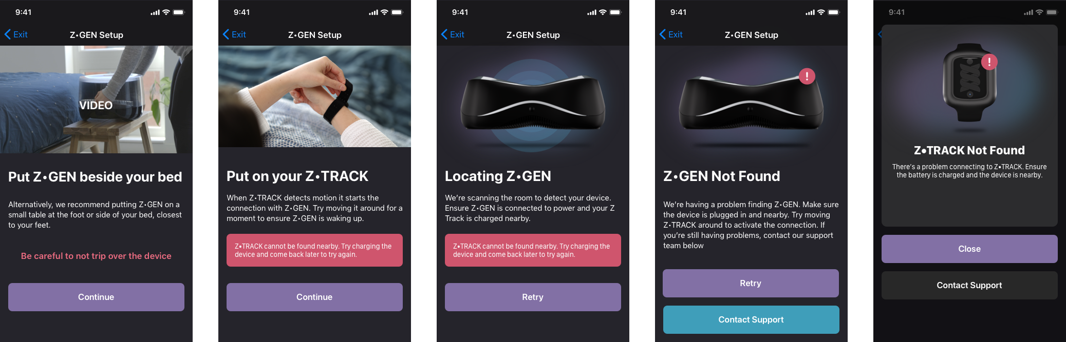
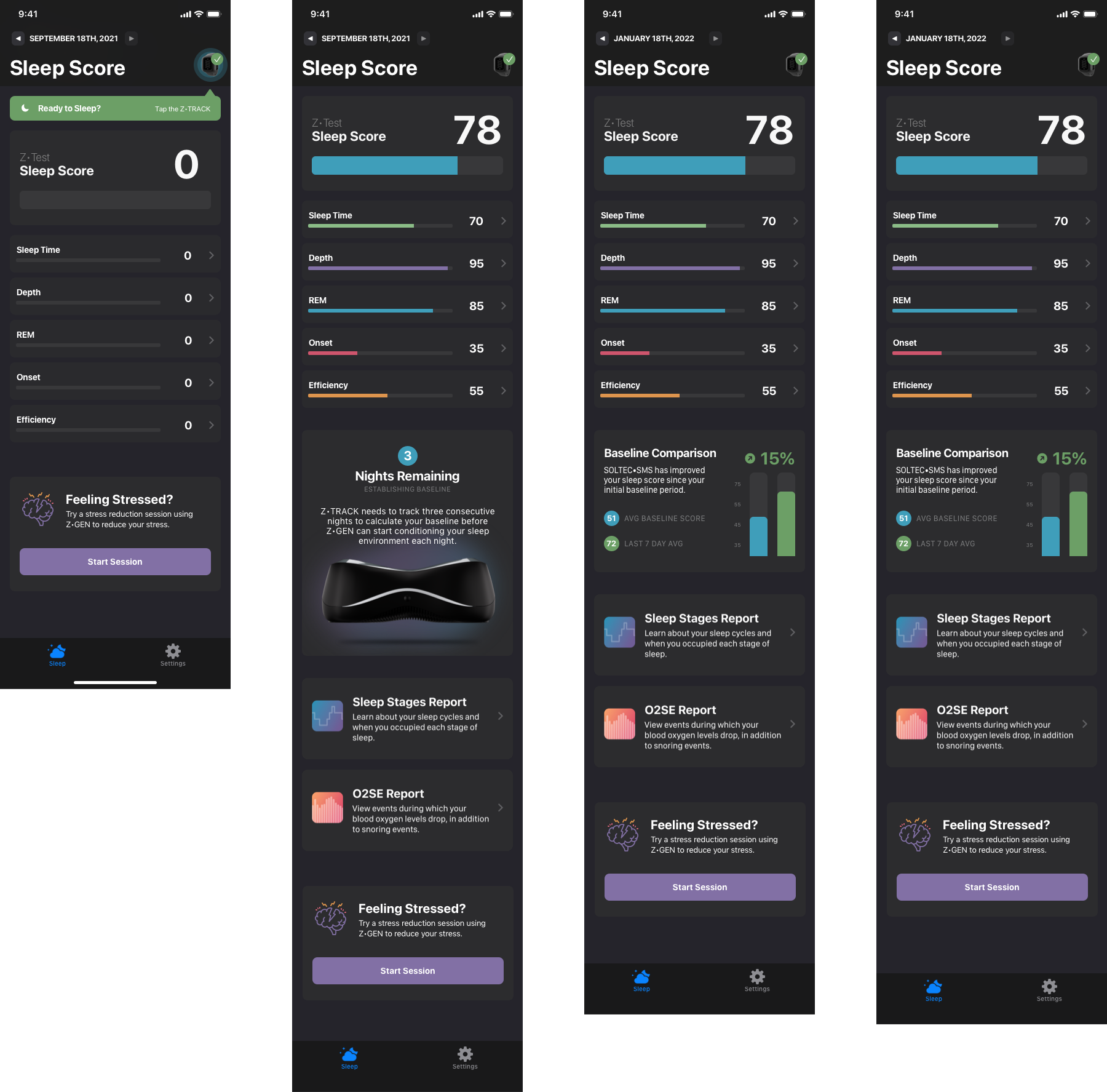
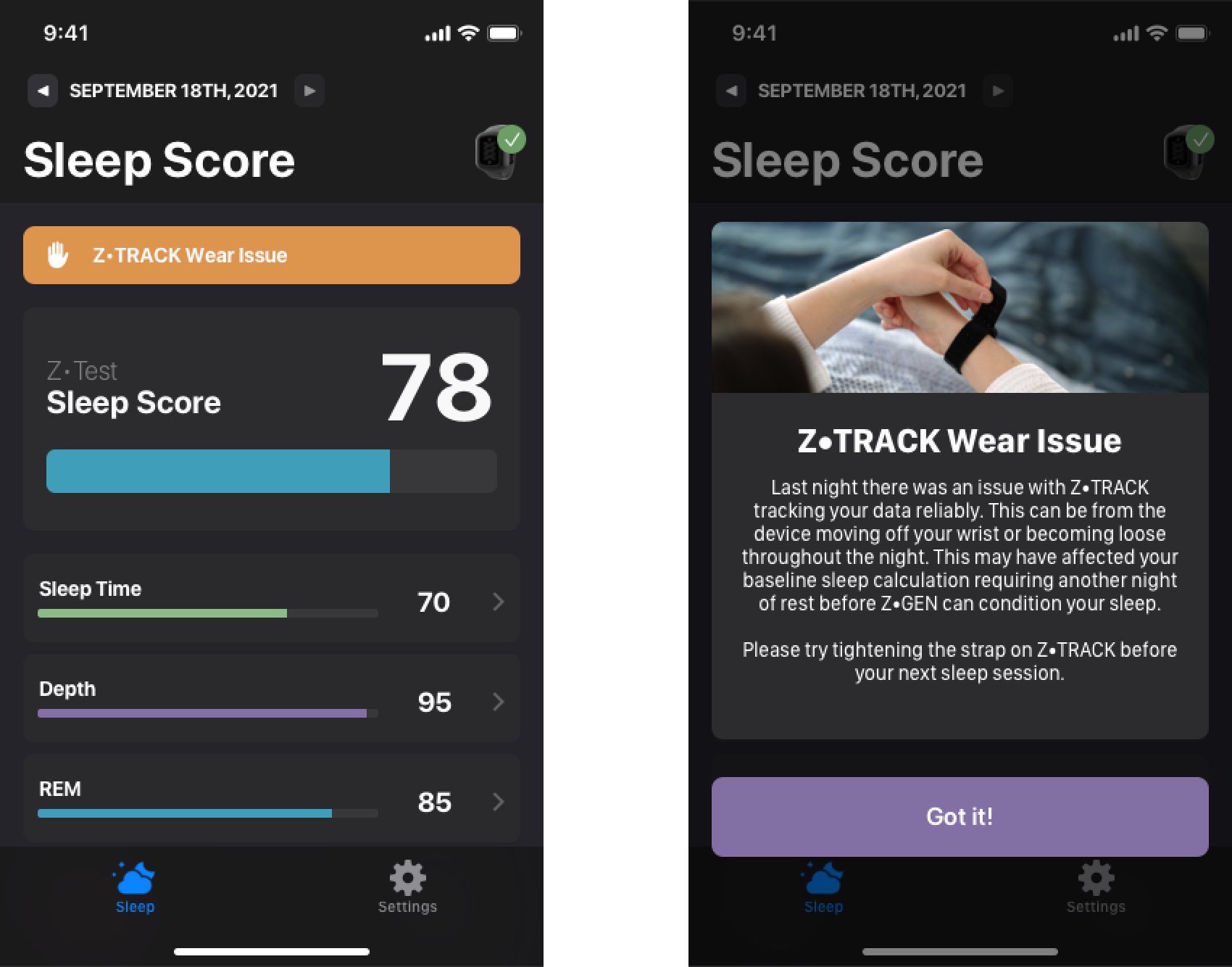
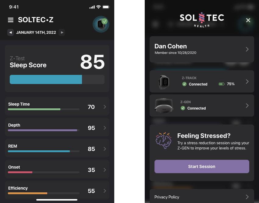
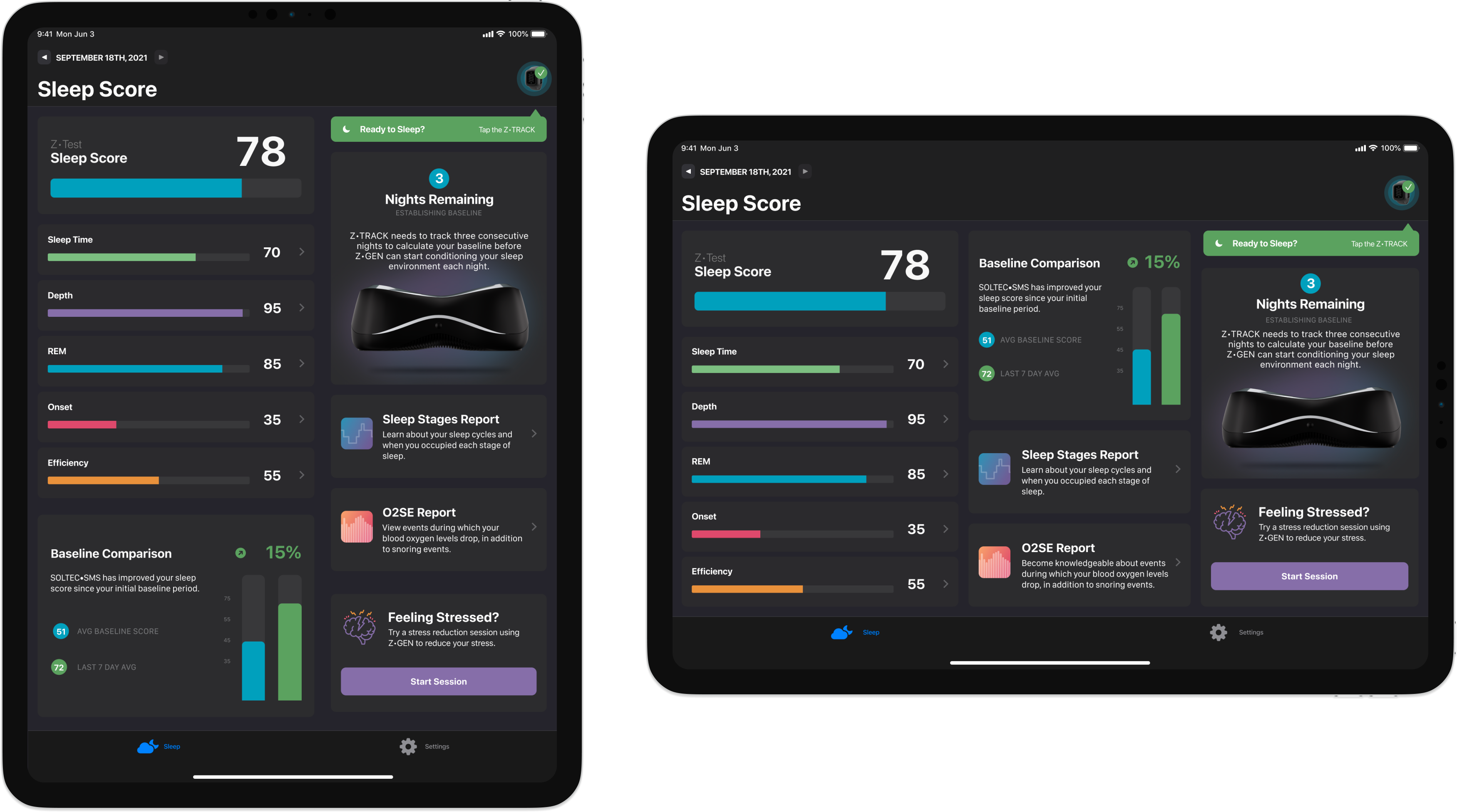
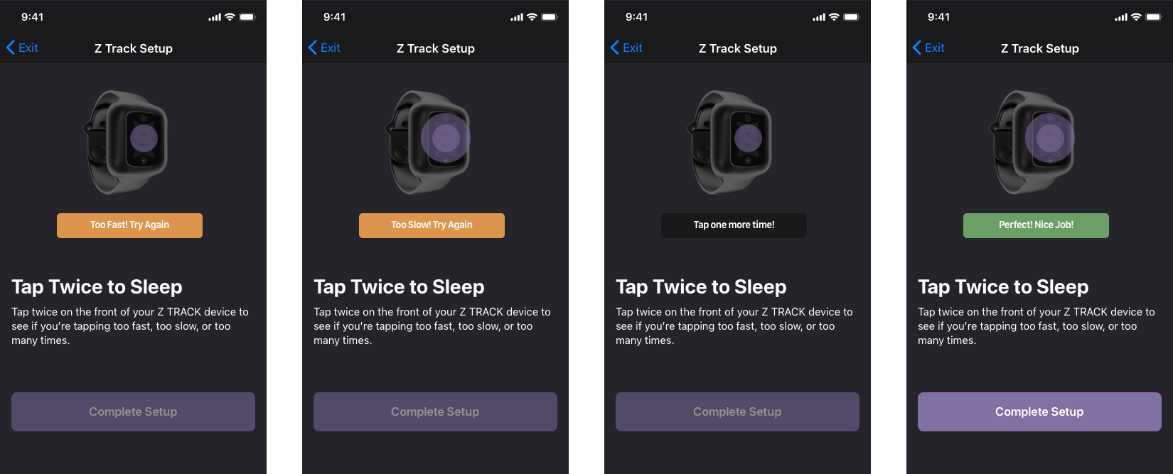
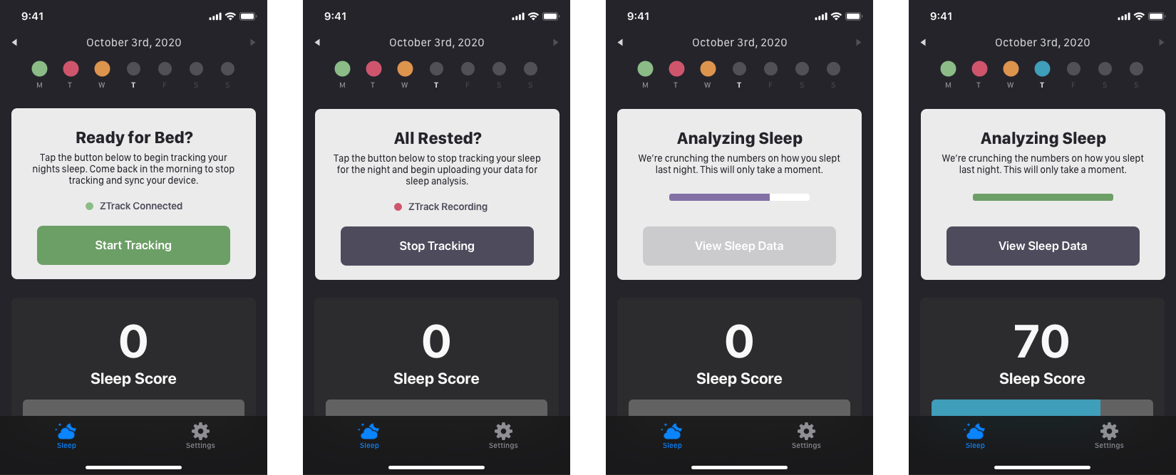
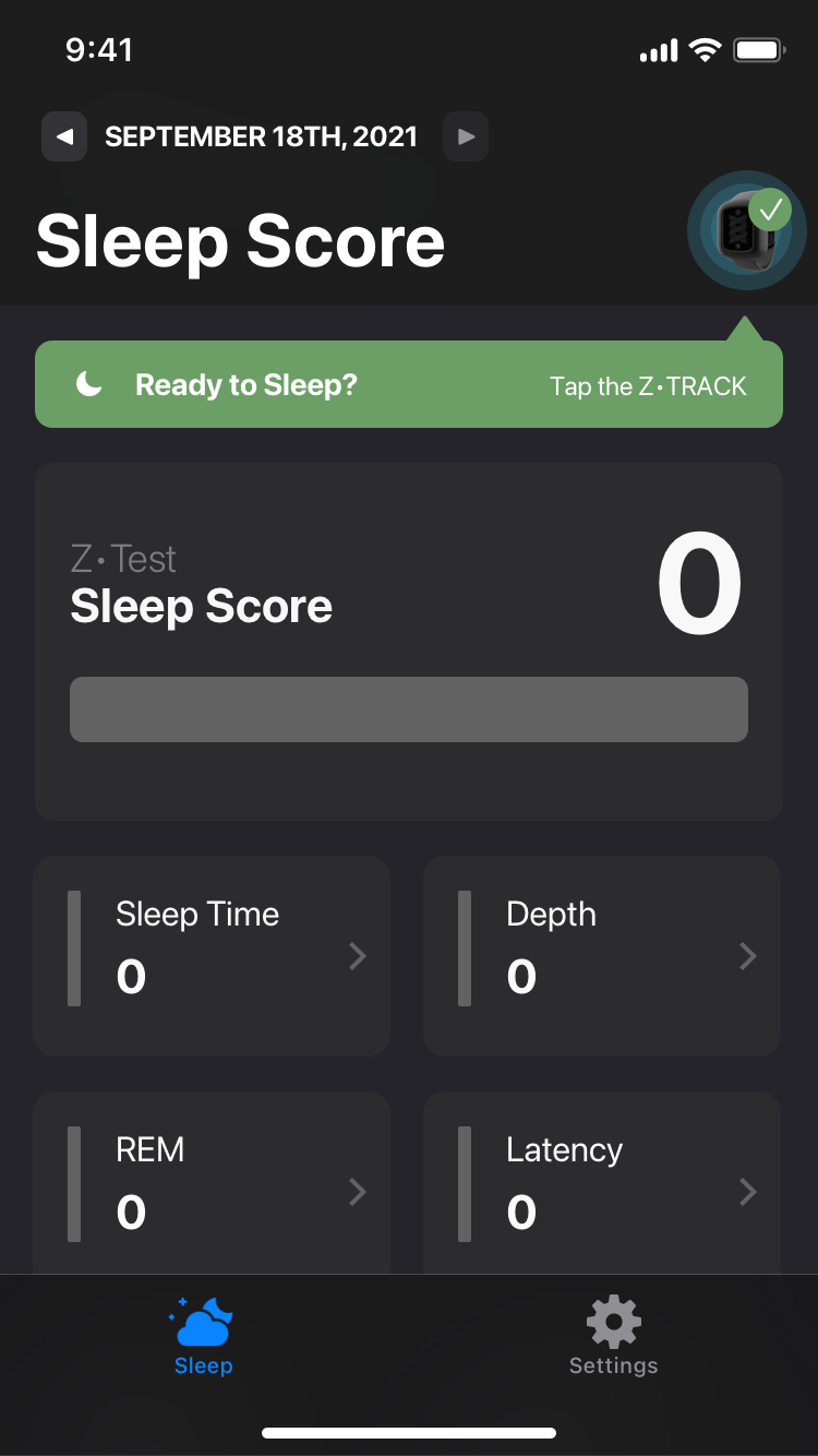
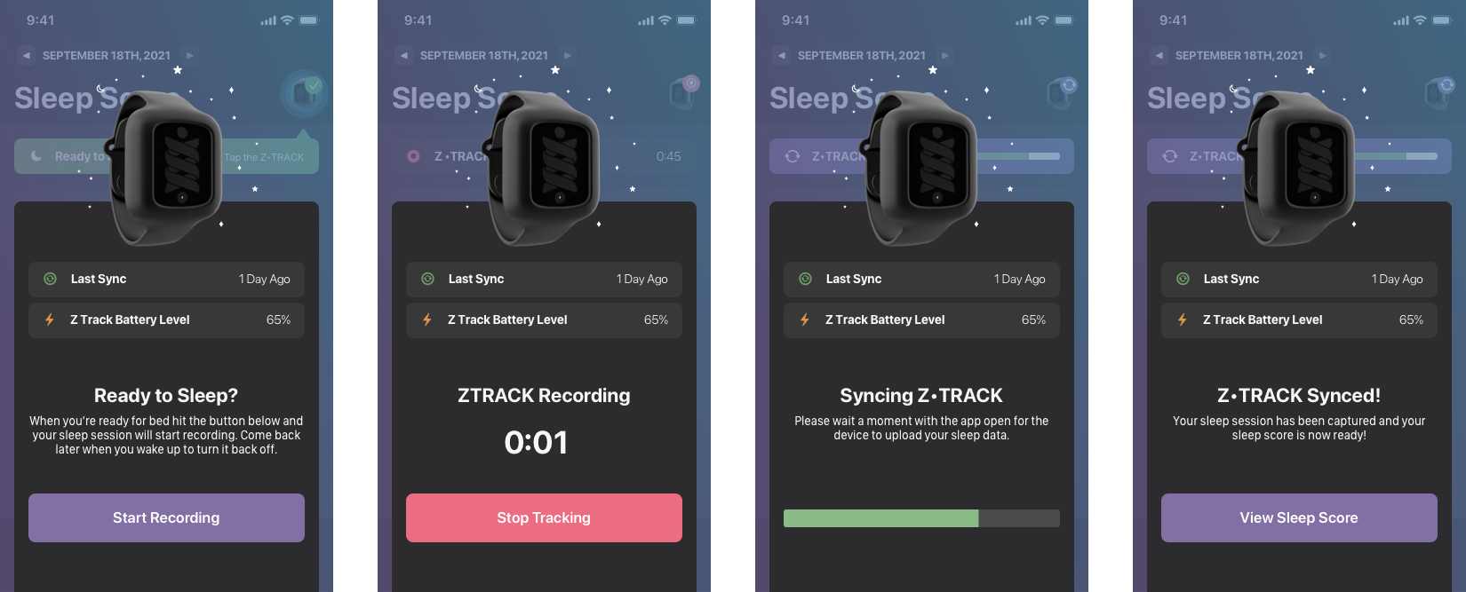
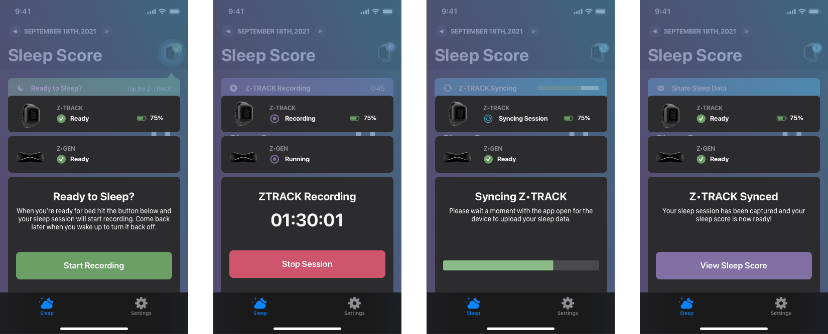
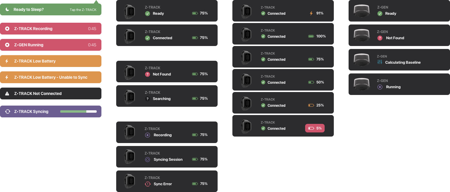
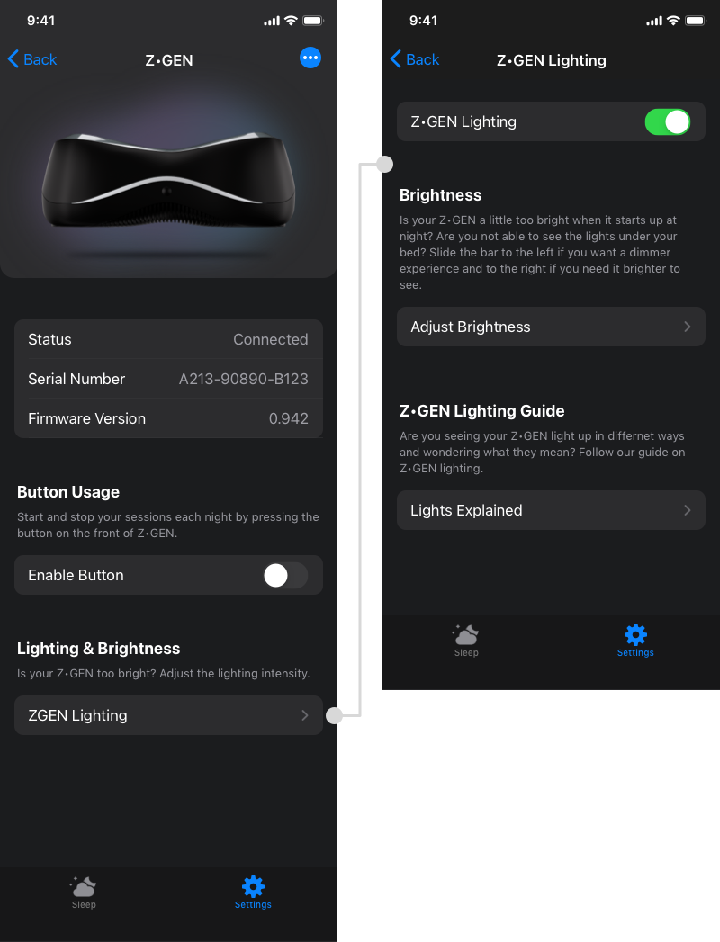
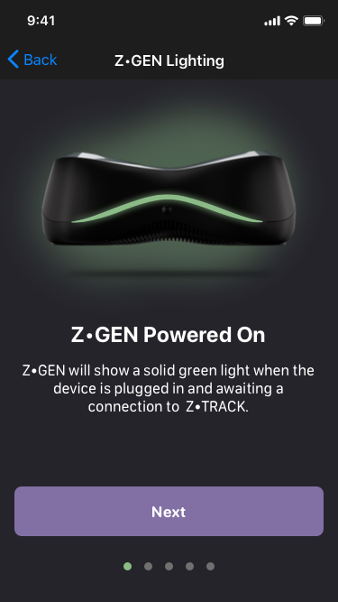
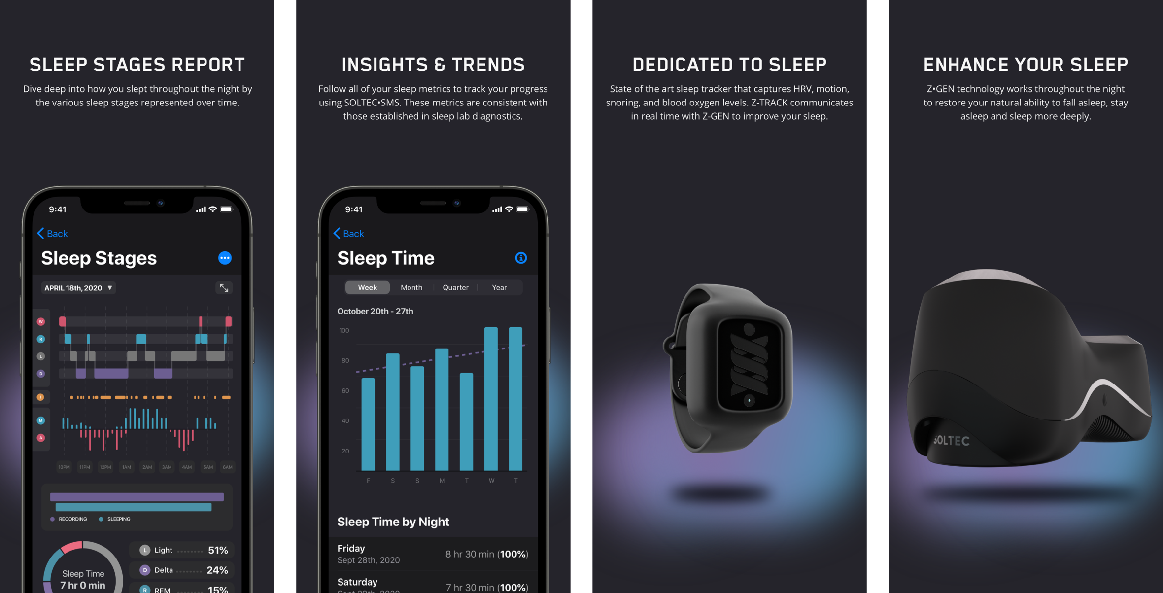
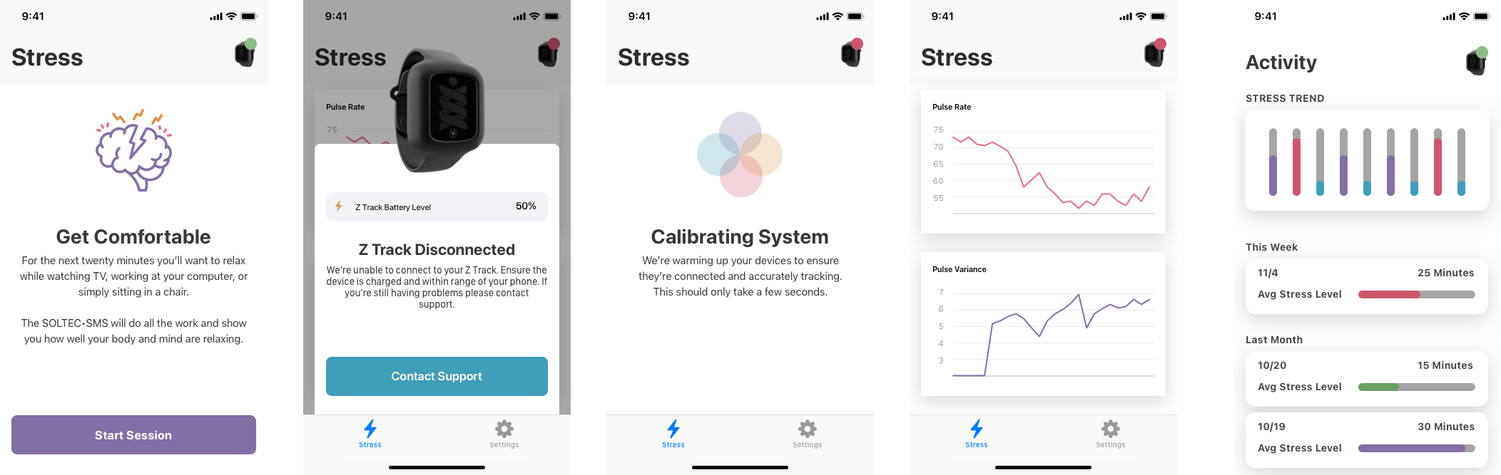
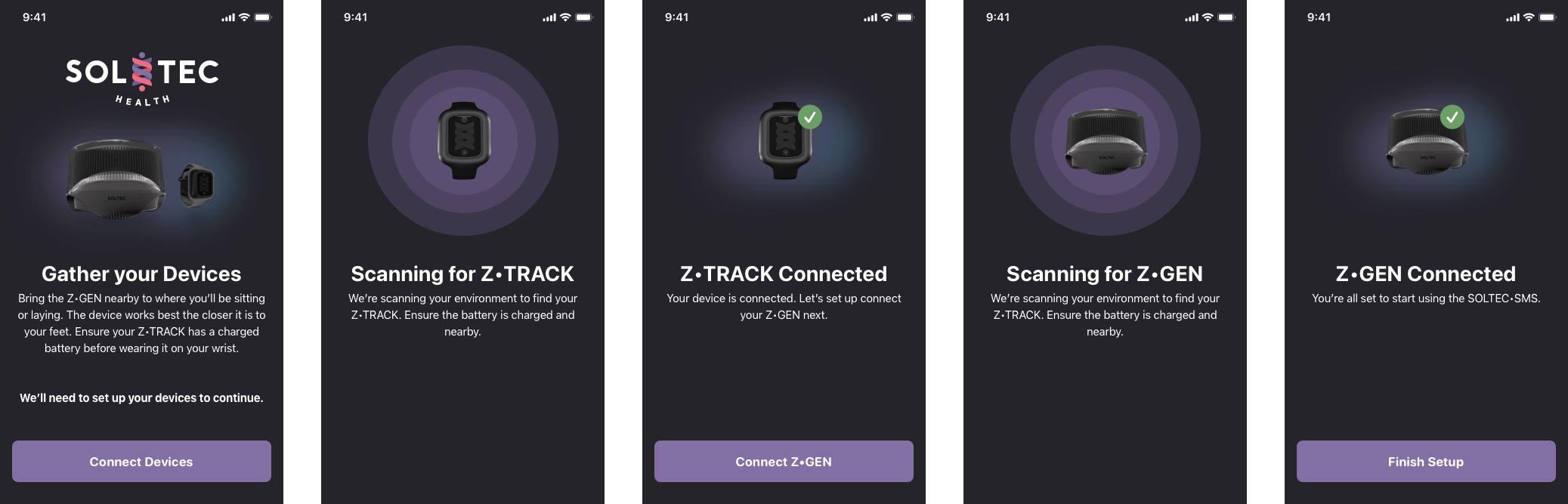
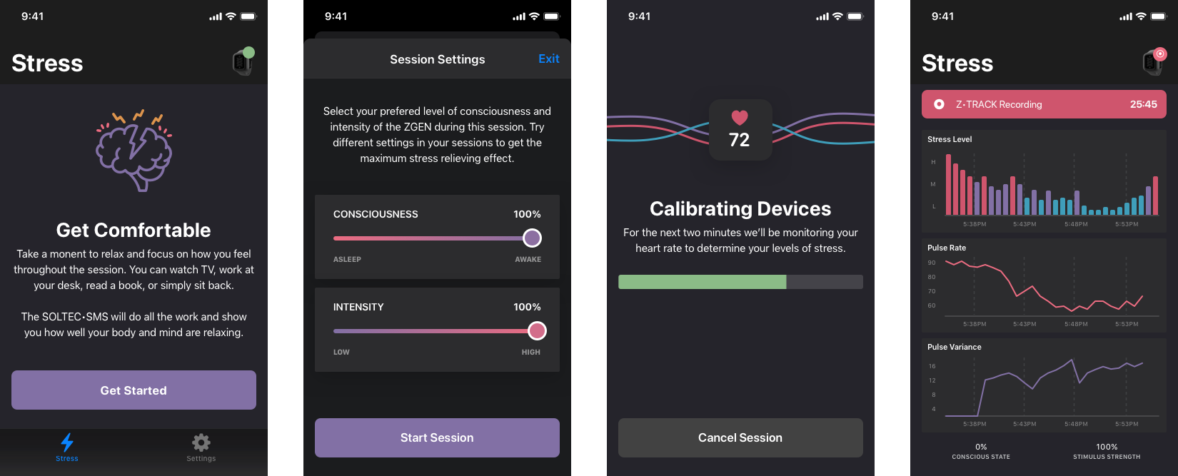
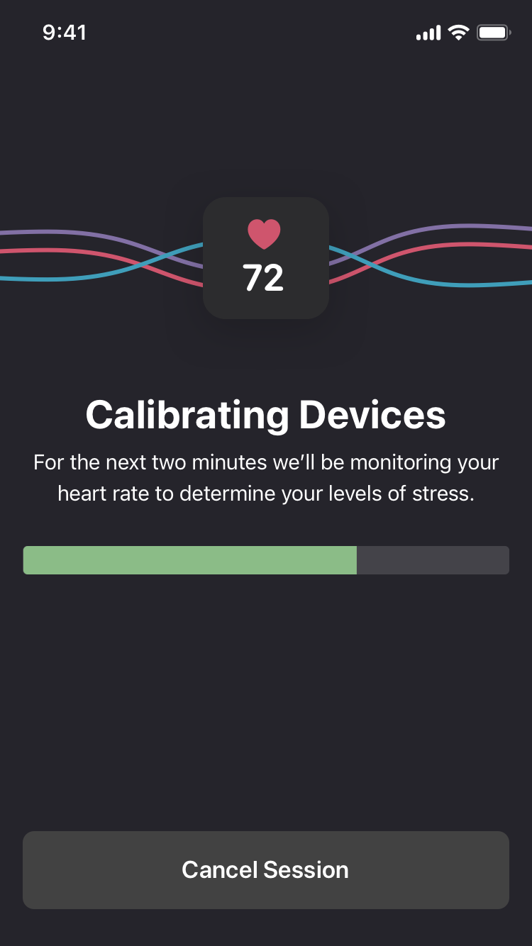
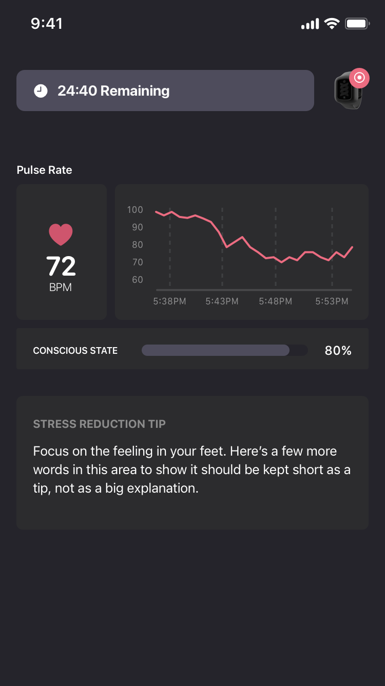
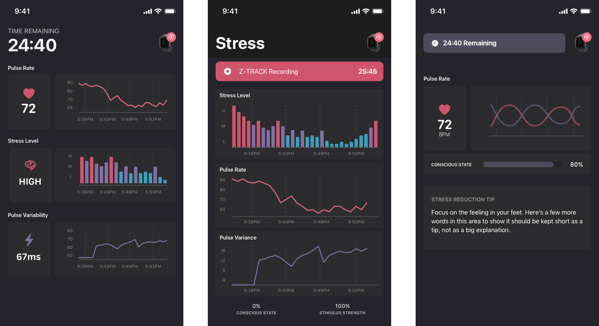
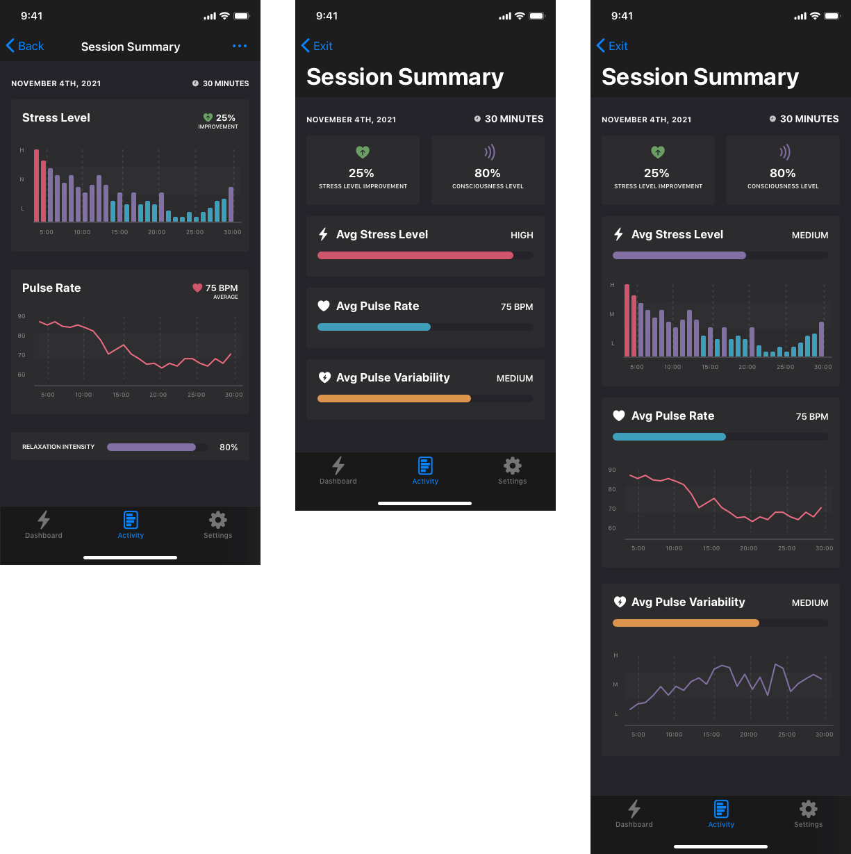
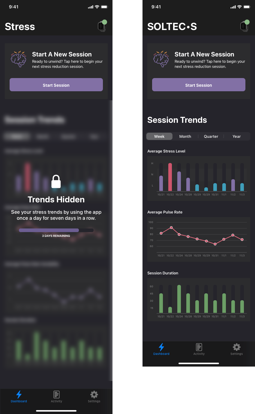
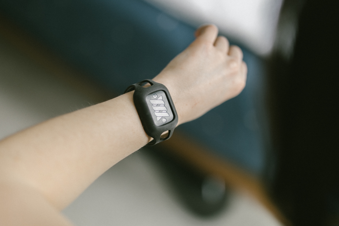
Sleep Tracking App

A new way of tracking and inducing sleep

How I helped bring ideas for the next generation sleep tracker from conception to a fully featured app that's elegant and

Another Sleep Tracker?

The market is quite saturated with sleep trackers; from Whoop to Oura, it's all been done. I've used the majority of these trackers over the years trying to unlock some secret to my health with very little luck. The difference with this system is the component of putting a device under your bed near your feet that has claims of putting you to sleep and keeping you a sleep. This is the first device I've seen that actively helps you sleep. The device under the bed connects with the wearable to adjust its strength based on your biometrics throughout the night.

Sleep Tracker Wearable

Wearable

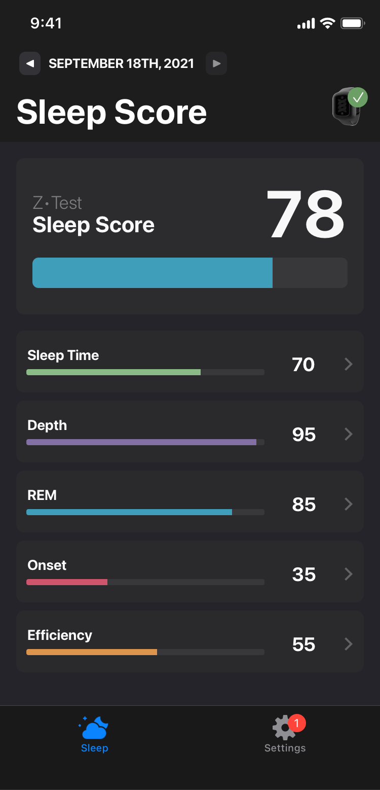
Unlike other sleep trackers this one is worn only at night. It doesn't track your workouts, tell the time, or anything else; it simply monitors your blood oxygen, pulse, and motion. There's no buttons on the device and you have to manually start recording your sleep through the app. It reports all of this information in real time to its sibling device.

Inducer

This truly is where the innovation resides; a device you put under your bed that emits frequencies to help you sleep. Even if I tried to tell you how this works, I'd be wrong. The wearable sends all of the biometric information to this machine and it produces more or less frequencies based on the stage of sleep you're in.

Sleep Induction
Why join this project?

Why did I help?

The CEO approached me to help with video work and learned I'm a full time product designer and was needing help with building an app. At the time I was helping manage a YouTube channel called The Sleep Sherpa; doing all the video production for the channel to review mattresses and other sleep devices.

I'm very familiar with wearables as I've owned Amazon Halo, multiple Fitbits, Apple Watch, a Garmin device, and more; it was something that's pretty established. The idea of them having a device that could MAKE people sleep better was intriguing so I thought hey why not help these guys for a couple months get to market and then see if their product takes off or not.

Skills Utilized

With this project being on such a small team, at an early phase, with a narrow scope; I skipped a lot of typical UX steps/deliverables to aim for speed to market. I spent a ton of the initial time understanding the project needs, working with developers to understand the tech, then hop right into visual design to quickly iterate on concepts. I was the sole designer on this project but also helped coordinate development, QA, and marketing initiatives like product photography and video.

My Design Role

Project Approach

These guys wanted to move quick and had very little to work with in the app space; no tech established, a minimal brand guide, and everything else was TBD for hardware and data. I approached in the most flexible and expedient way; use Apple's base HCI library, build the smallest screen size first, and focus on the basics. I prefer to have the team flow things out, define all the data, do wireframes, then polish the brand; but the team was not favoring an ideal software development/design process. So I had to walk behind them winging it.

UI Design Process
Software Tools Used - Sketch - Trello - Principle

Connecting Devices

The first step in the experience is connecting your devices to the phone so I started here with design to walk through the user journey of someone getting started. There's a lot of versions not shown and a lot of the mistakes we learned along the way that informed a better user experience. I really enjoyed this process as it stressed the importance to the team of holding the users hand at the start.

Setting up Devices

Device Setup

When users get their devices they need to connect them via Bluetooth to the app in order to operate them. I tried to make the experience as intuitive as possible knowing that the target audience includes older people who may have little experience connecting Bluetooth devices.

Wearable Setup

Out of the box users need to charge their devices and then connect them via bluetooth. There was a lot of compromise on the user experience due to the unknown charge on the device battery; so telling users to put it on and connect to it right away was misleading. Overall I strived to make the process simple despite needing to give the user a lot of instructions on how to properly use the device.

Setting up Bluetooth Devices
Bluetooth Pairing

Inducer Setup

The device that goes under the foot of your bed was a lot easier for users to set up; just plug it in, slide it under your bed, and then connect to it via Bluetooth.

Setting up Connected Device
Conection Setup
Finishing Setup

Sad Paths

A senior designer can help you save time and energy by addressing problem areas before they become problems. I found areas where users could get under their bed, would be out of range of their devices, or even try to set them up in the wrong order.

User Experience Sad Paths

Sleep Dashboard

Once the devices are setup users will see the dashboard and access everything from there; toggling on/off sleep sessions and viewing their overall scores.

Dashboard

Given that users would be from ages 30-80 I wanted to keep it the designs very simple by making tappable tiles. Users can traverse dates, start/stop sessions, see their device status, previous nights scores, and drill into charts and graphs on how well they've been sleeping over time.

Sleep Tracker App Dashboard

Dashboard States

My favorite thing to make is one interface that needs many different states; it's a lot of fun to figure out how to balance the experience for the first time a user opens the app all the way on to where they've been using it for weeks or months. Here are a few examples of those different states for this one screen.

Sleep Tracker Dashboard States

Sleep Scores

If you've used any other sleep tracking product you're familiar with a sleep score based on how well you slept. There's a lot that goes into calculating a score but I wanted to make it easy for users to have a quick glance at their numbers and associate the brand colors to their performance. Purple is the brand color and so rarely shown I wanted to keep that as a special indicator. Given all the sub scores people see enough variety in the colors to learn what's good and bad.

Sleep Scores

Sub Scoring

Your total score is made up of a combination of other metrics of how you slept; this is unique compared to most products out there which calculate based on how long you slept. How much REM, Deep sleep, and how much tossing and turning are all factors in making up a healthy night sleep and quantifying that back to people.

Sleep Scoring Sub Scores

Baseline Calculation

Users need to let the system observe the first few nights of their sleep to understand their patterns and develop a baseline to work from. I made a handful of designs to tell users on their dashboard that the system would take time to calibrate and let them know the system is working correctly. The top design was my original in the prototypes and the bottom is production after I tested a few versions.

Measuring Baseline Sleep

Detecting User Error

During the testing we found some users weren't wearing their devices correctly and it was negatively impacting their score. As time went on we were able to tell which users we having problems based on the patterns we saw and eventually alert people right on the dashboard of their problems and encourage them to correct their device posture.

Poor fitting sleep tracker causing faulty readings and scores

Navigation Menu

I spent a ton of time on the app making sure it flows together really well by making sure people know where they are and how to get back/forth. Later in the iterations of the dashboard I introduced a hamburger menu as the Android implementation was approaching.

Hamburger Menu Navigation

Native iPad Support

As progress went on more people we added to help test the system, we noticed people were using their iPads as their main device. Seeing the app displayed as a smaller phone like version in the center of the screen didn’t make much sense. I spent a few extra moments to create a native version for iPad users that reshuffles and scales the tiles around to utilize the larger space.

iPad Compatibility

Tracking Your Sleep

Unlike other sleep trackers that automatically detect your sleep, this hardware was unable to copy that user experience. I had to come up with a way for users to start and stop their sessions every night and morning. It had to be clear to users opening the app in a groggy state that their session was still on and it needed to be turned off.

Tap Twice to Sleep

The CEO was passionate about an idea where users could tap the wearable twice and it would activate the hardware on their wrist and the unit under the bed. The reason was for people who didn't want to have their cell phone in the bedroom or use it before bed. I encouraged them to look at adding a small switch or button to the side of the tracker. We went ahead with this idea, the best way for people to learn is to see it for themselves.

Tap Instructions

I added a screen to the device setup process telling and showing users that tapping twice starts and stops a session. Everything went great with this part but we ended up finding that users weren't able to turn sessions on through this method like we hoped.

Interactive Instructions

When we tested this out some people were only tapping once, others too fast or too slow, or tapping too many times! I took this as an opportunity to make the onboarding process more interactive and stop users in the process and ask them to try it in real time. When the user would tap on the device it would show the tap on the phone and give them helpful tips. The users would need to tap twice in a way that the system could detect to move on from that part of the app.

Interactive instructions

In-App Controls

Initially I made something really simple to allow people to start, stop, and sync their sessions while we were debugging the hardware and making sure the connection was reliable. It's brutal, ugly, but overall very effective. I show this because you can see the sexy end results later but it's important to know that not all ideas start off pretty and polished.

Initial method of starting and stopping a session

Improved App Controls

I came up with this idea of having the wearable in the top right corner with some sort of beacon animation and a toast under it telling people to tap on it to begin their session. Tapping the icon brings a drawer up from the bottom with all the information they'd ever need.

New dashboard interaction

The drawer was a great improvement and well received by users. It included everything about the device; whether it was connected or not, the battery life, the sync status, and so on. This space allowed for a lot of edge cases for things like explaining to users why their device wasn't connected, if a session needed another attempt and syncing, and so on.

Improved method of starting and stopping a session

Final Designs

After using the designs for awhile I began to find users who weren't sure of the state of their other device, and let's be honest the giant image of the tracker is overkill. I really boiled down the utility of this drawer into something that would let users see both of their device statuses and be able to see more information on their session status overall.

Final Start Stop Session Design

Components / Variants

When building all these different elements the whole time I kept my eye on patterns that could be reused for each state and patterns that allow for flexibility. This is my background in development showing and I'm glad to see it be more common in design now adays with components and variants.

Components and Variants

Visualizing Usage

I love helping teams gather data and present it back to them to learn from it. After each night of sleep users need their data reflected back to them to show

Basic Charts

When a user taps on any of the scores or sub scores they see a chart showing their score for that day, week, month, and year. It's not very creative but it was what the client wanted to start with. I tried many different versions but landed on this; I learned the hard way that showing the color scoring on each bar was a terrible idea.

Basic Charts

Sleep Histogram

Each night users have a histogram available that shows their different stages of sleep throughout the night. You've seen this before if you use other sleep trackers. This was my first take at designing the interface from the team based on limited information and showing the team we could take many screens and combine them into a single view.

Sleep Histogram

Landscape View

Users who want an expanded view of their histogram can rotate their phones or tap on the expand icon to see the chart in a larger view. This came from a stakeholder that insisted on seeing more and more detail with ideas that weren't possible on our small development team nor requested by any actual users.

Sleep Histogram Landscape Design

Graph Onboarding

Unless you've used a rival sleep tracking app before, it's likely you won't know what the graph is trying to show you. I created this experience for users to see at their first viewing of the graph, but it's a lazy approach to educating users and I find people often skip these types of screens.

Onboarding Sleep Stages

Improved Onboarding

When we had downtime months later I approached the onboarding process a little differently and instead of putting up a series of signs for users to read, I tried to make it so they've have to walk through each element on the screen as a joyride. I hate these experiences just as much but know they can be a little more effective in user testing.

Improved Onboarding Sleep Stages

Trends & Insights

As time went on I encouraged the team to make more insightful visualizations of peoples data. Don't make them look at charts/graphs and interpret how they're doing; bring them insights and tell them how much better/worse they're doing!

Improving Sleep Metrics

Sleep Improvements

In UX I preach bringing users good news instead of making them look for it. This is an example of a tile that shows up when users are starting to see improvements in their rest, showing the progression over time.

Declining Scores

Inversely when users are starting to sleep worse that information should be elevated to help the user understand why and provide them with guidance on making better decisions in their sleep hygiene. I'm not for scolding users, especially for something that's hard to control, but a small amount of shame helps.

Worse Sleep Metric
Improving Sleep Metrics

Summarized Trends

Similar to showing progression overall, I recommended ways for us to highlight specific metrics that are positive and negative to better teach users why they wake up feeling the way they do. There's hundreds of permutations that can be made just from this one idea.

Detecting Problems

Detecting snoring isn't revolutionary, nor is showing it back to a user, but we originally showed it in a complex chart that users had to select and then look through the data to find it. I wanted us to highlight it and bring it to the user as a smaller tile which will take you for a deeper dive when clicked.

Snoring Detection & Trends
Comparing sleep by month

Small Comparisons

Another example of summarized trends is showing a comparison of one metric over two larger periods of time. Breaking away from showing complex charts, graphs, and other visualizations to show micro content blocks that we can track if the user taps on them to measure engagement.

Easy Comparisons

Great; I'm snoring less/more, getting more deep sleep, less light sleep, but realistically how am I doing in comparison to the normal person? Huge fan of using radar charts for this time of data, but and even bigger fan to bring data to people to let them compare themselves to others. We all do it every day in stupid ways. Why not use it in ways that people can better themselves instead of grow in resentment?

Ideal Normal Sleep Comparison

Hardware Integration

Both hardware devices had a lot of opportunity for design to improve their interfaces. By the time I could offer help, the team already had their decisions made on the hardware, despite some of it potentially making for a more difficult user experience. I jumped in to help with the device lighting to better inform users on what's happening with the device as it's operating under their bed.

Device Lighting

When we got devices in our hands the engineering team had a single blue LED inside of the device that our QA lead couldn’t understand what the indications were. I stepped in to create the guidelines on how to use the LEDS to better indicate what the device is doing to the user.

Light Settings

The device details page has many other features like updating firmware, resetting the device, toggling a connection light; but I want to highlight here that users can go back and get in-app help information for the lighting. The "lights explained" tab opens up a tutorial to walk people through what the lights mean incase they didn't understand during onboarding or forgot.

Device Settings

Lighting Tutorial

Within the device settings users can go through a series of screens that shows them what the colors mean for each state. The lights on the device will light up while the tutorial is being performed. I was really happy with how well these turned out, but didn't get to run the user testing I had hoped on whether it helped.

Lights on
Device Lighting Tutorial

App Store Prep

Having a great reputation on The App Store is key to help brand reputation. Have you ever bought a tech product and then went to the app store to see their app is terrible? I wanted to boost our products reputation for people who are considering buying the hardware but want to make sure the app is legit. I worked with marketing to reinforce the value propositions not only for the app but the product itself into 8 screens.

iOS App Store Designs
iOS App Store Designs Continued

A New Usage - Stress

The inventor of the device believed a certain mode of the app could be useful for reducing stress while people are awake; all while they watch TV, read, or work on the computer next to the device. While the effects of the machine for sleep could take weeks or months, the stress protocol could be felt the first day of using the system. The idea is this would result in less returns and higher satisfaction by feeling the system working in real time.

We were tasked with creating a whole new app from start to finish within a month.

App Overview

The app is pretty simple; users need to pair their devices (again unfortunately), select the duration/strength of their session, relax, and then view graphs showing their stress levels over time. Originally I wanted to make this app with a light theme, but we went with the dark theme based on the teams executive decision.

Setting up devices
Stress Session App Overview

As more screens were fleshed out we moved back into using the dark mode paradigm. I rolled with these designs after the initial release as we added more and more features. Ironically we're currently looking at going back to the light mode version in a later release. We didn't build the sleep app to switch between light and dark mode natively and by reusing those elements we painted ourselves into a corner later.

Device Setup
Stress App Overview

Device Calibration

Users need to wait 15-30 seconds at the beginning of each session to let the wearable get a consistent reading on your pulse rate to establish a baseline for that session. I worked with the developer to come up with various ways to animate something to indicate the session was loading and activity was happening.

Calibrating Devices

Running a Session

I had a lot of different designs for this screen and had many debates about what the purpose of showing data was. Initially it was great to see all this live data being parsed for us to debug and experiment with, but I challenged the team that users should be relaxing and not staring at their screens. The irony would be users getting more stressed out because their stress isn't reducing!

Recording a Session

The following are concepts we used for debugging different ways of measuring and displaying stress to the users.

Stress Session App Overview

Stress Settings Results

When the session is complete users are taken to a page where they can see visual representations of their stress levels throughout the session. I came up with a few different designs to test out and these are a few of those, including the first design which is in production.

Sharing Results
Sharing Feedback

User Feedback

Quantitatively we can see how users are performing, but I pushed to add in qualitative analysis to see if users reporting any feelings of relief. At the end of their 3rd session we show this screen to ask how they're feeling so far.

Trends & Engagement

Any app that shows charts and graphs looks foolish until the user gets enough data in to show something interesting. It's even worse when the users don't consistently use the app; especially when the data is showing weekly trends. I recommended we hide their stats until they perform enough sessions that week. Otherwise the data is too difficult to compare if weeks and days are missing.

Stress Trends Dashboard